Fall is not just a season; it’s an emotion, a mood, and a design possibility that is so much more than cooler temperatures and pumpkin spice. As trees change, so do tastes in wardrobe and clothing. If you're smart about it, with the right DTF fall color palette, you can convey the essence of fall onto your products.
As a small clothing company or print-on-demand seller, you have the opportunity to reach a new niche that appreciates investing in unique winter designs that are visually stunning and comfortably practical. Selecting the appropriate t-shirt designs is critical for capturing the warm, sharp autumn vibe that fuels fall sales.
Most autumn color palettes for apparel are designed to enliven your DTF t-shirt designs, whether you're focusing on soft fall pastels, bold seasonal declarations, or nature-inspired neutrals.
In this post, we’ll look at five awe-inspiring cool colors to inspire your next winter DTF collection. So, let’s jump right in without further ado!
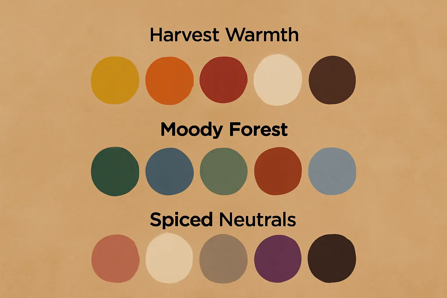
1. Harvest Warmth
Theme: Welcoming, nostalgic, and cozy.
Mood: Lifestyle tees, Thanksgiving collections, or farmhouse-inspired clothing.
Fall reminds one of bonfires, baked goodies, and changing leaves, which are warm recollections. Suitable for mustard yellow DTF transfers that conjure home, family, and heritage, the Harvest Warmth color scheme draws on tradition and comfort.
Color Range:
-
Butternut Gold: A golden-orange hue akin to roasted squash and autumn leaves. With great saturation, it’ll print very well on natural cotton.
-
Rust Clay: Dark burnt-orange that brings depth and classic warmth to interiors. Ideal for olive green fall tee ideas and retro-inspired natural typefaces.
-
Maple Red: Inspired by fading leaves, this red offers strength without drowning. For minimalist fall quotes or seasonal drawings, it is quite effective.
-
Warm Oat: Creamy beige with gentle undertones. Any fall t-shirt color ideas will be softened by this neutral, which also matches textured fonts.
- Coffee Brown: Dark, velvety, and grounding. Coffee brown adds contrast and grounds all the other colors in this palette to give a more structured sensation.
Thanks to heat-pressed color layers, these hues retain their richness and texture even on black shirts. Use them to bring your cozy fall color scheme designs to life with premium vivacity and emotional resonance.
2. Moody Forest
Theme: Earthy, enigmatic, and contemporary.
Mood: Wonderful for outdoor enthusiasts, hiking supplies, spiritual collections, or nature brands.
This palette draws on the muted, foggy beauty of autumn woods. With a modern, gender-neutral approach, it leans toward greens, grays, and natural undertones. These colors are ideal for fall foliage color palette for DTF transfers and warm outdoor transitions. The Moody Forest palette is vivid yet grounded.
Color Palette:
-
Deep Moss: A dark green base color drawn from forest floors. Works well with burgundy and brown shirt palette themes.
-
Storm Gray: Excellent for backdrops or text overlays, this neutral offers a modern edge.
-
Pine Needle: A mid-tone green with blue undertones. Outdoor designs and lifestyle logos mix perfectly with this.
-
Burnt Cedar: Almost burgundy, this deep reddish-brown adds moodiness and warmth to any nature-inspired print.
-
Smoky Slate: Soft and smoky bluish-gray that enhances the greens and offers depth to autumn t-shirt color combinations.
These shades offer contrast on both light and dark shirts, enabling designers to create complex prints for outdoor brands. DTF transfers make it easy to layer forest silhouettes, topography maps, or spiritual elements with precision and subtle gradient blending.
3. Spiced Neutrals
Theme: Minimalist, trendy, and versatile.
Mood: Ideal for boutiques, unisex apparel lines, or minimalist streetwear
If you like a chill vibe for fall but still want to look stylish, go for Spiced Neutrals. These colors resemble cinnamon lattes, cozy blankets, and warm, quiet evenings when the trees have lost luster. These colors are great for DTF pastel t-shirt designs and t-shirt designs that give off a modern, luxurious fall feel without being too flashy.
Color Palette:
-
Cinnamon Blush: A muted rose with spicy undertones. Feminine without being overly sweet, it is great for elevated fall fashion.
-
Vanilla Cream: A warm off-white that acts as the perfect canvas or soft accent in best heat‑pressed summer shirt color combinations that carry over into fall.
-
Dusty Taupe: A gray-beige neutral that’s grounding and ideal for unisex styles.
-
Spiced Plum: A rich purple with a brown base, perfect for a moody type or warm earthy tones t-shirt design for autumn.
-
Charcoal Brown: Deep and nearly black, this color works for shadows, outlines, or grounding base prints.
These tones are ideal for made-to-order fashion or small-batch boutique runs. The DTF process prints each color with clarity, from the softest blush to the darkest brown, without dulling. These are the best fall color combos for DTF apparel that print clean across a range of fabrics.
Why Fall Colors Matter for DTF Printing
Color tells a story. In fashion, especially with seasonal prints, your palette is your narrative. The right colors speak comfort, nature, or elegance, depending on how they're used.
DTF gives you the flexibility to print detailed lines, gradients, and textured layers that mimic the depth of fall leaves or candlelit interiors. With the right palettes, you can explore summer fruit print color trends DTF that transition into autumn tones or move from trending summer colors to richer shades to create sharp prints.
Unlike other methods, DTF lets designers capture subtle moods and detailed emotions, allowing seasonal collections to reflect nuance and creativity.
How to Choose the Best Fall Palette for Your Brand
Each of these palettes evokes a different emotion and market. Choose what resonates most with your audience:
-
Lifestyle & Family Brands: Go for Harvest Warmth if your designs are focused on tradition, nostalgia, and home-inspired themes.
-
Outdoor or Nature-Focused Brands: Use Moody Forest to lean into natural textures, adventure tones, and eco-aware aesthetics.
- Boutique, Unisex, or Minimalist Lines: Choose Spiced Neutrals for a soft, wearable sophistication that blends luxury with subtle color play.
Still unsure how to choose summer colors for DTF shirts that transition into fall? Start with your mood board. Understand your buyer. Build color into the emotion you want your product to evoke.
Final Thoughts
Fall isn't just a season; it’s a storytelling moment. At Music City DTF, we choose the best DTF fall color palette featuring visually appealing fall t-shirt color ideas so you can have designs that are more than visuals. Create feelings of cozy nostalgia, forest solitude, or minimalist elegance with our curated color palettes, which are excellent launchpads. Our DTF transfers provide you with the complete toolbox to bring these concepts to life with minimal hassle.
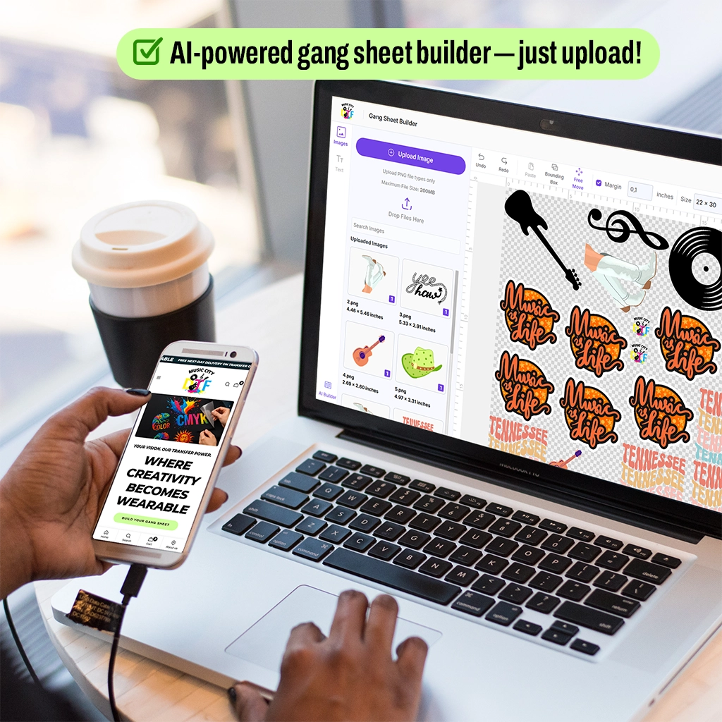
Ready to create some fall apparel? Try our premium-grade colors on your collections with our DTF Sample Pack and gauge the quality firsthand. And when you are ready, try our Gang Sheet Builder to build your first collection!