
Premium DTF Prints in Nashville – Custom Transfers, Apparel & More
At Music City DTF, we specialize in premium DTF prints in Nashville, offering top-quality custom DTF transfers, UV DTF gang sheets, and personalized apparel for individuals, brands, and businesses across Tennessee. Whether you're looking to design your own custom t-shirt, print heat transfer gang sheets, or create vibrant UV DTF stickers, our expert team delivers unmatched quality with fast turnaround. Proudly serving Nashville's apparel decorators, print shops, small businesses, and creatives, we make it easy to build your own DTF gang sheet, order DTF transfers online, and get ready-to-press prints that bring your designs to life. From custom shirts for events to wholesale DTF printing services, we’re Nashville’s trusted one-stop shop for all things DTF.



Collections
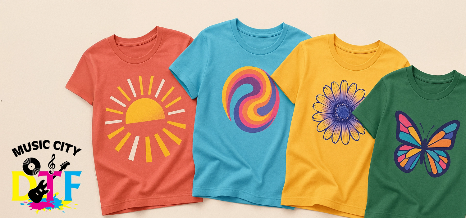
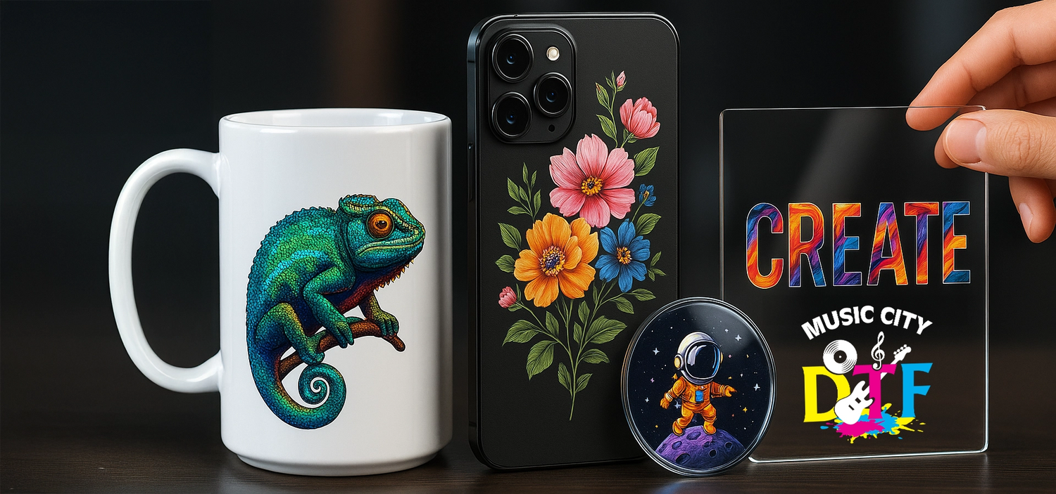
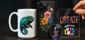
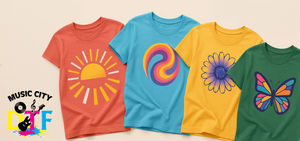
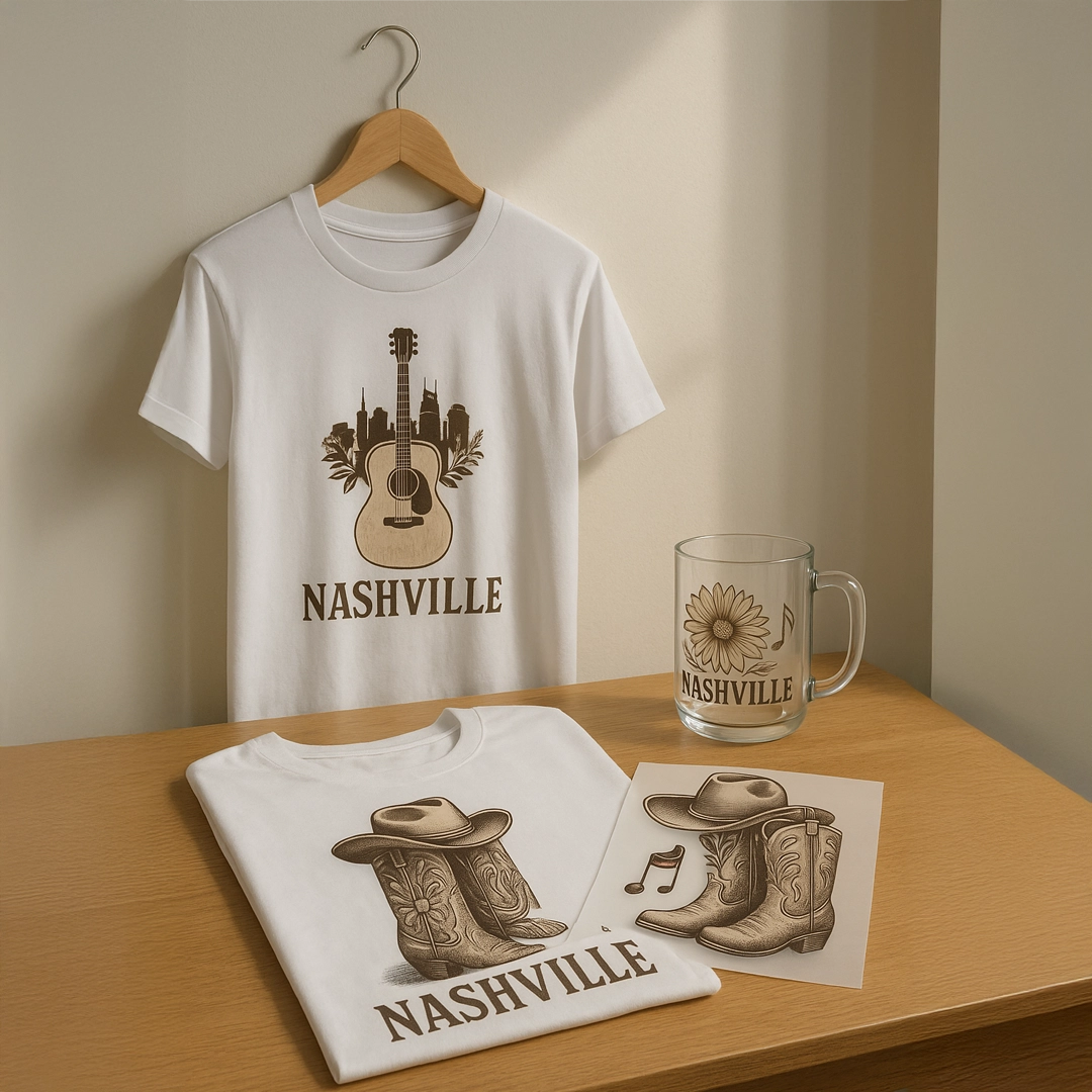
Explore our full range of high-quality transfers and custom apparel, including DTF, UV DTF, and unique custom shirts — perfect for personal projects or professional use.
Build Your Own Basket



Why Choose Us?
Same Day Shipping
Place your order before 2 PM and we’ll ship it out the same day to ensure fast delivery. Orders received after 2 PM will be processed the next business day.
Ultra Vivid Colors
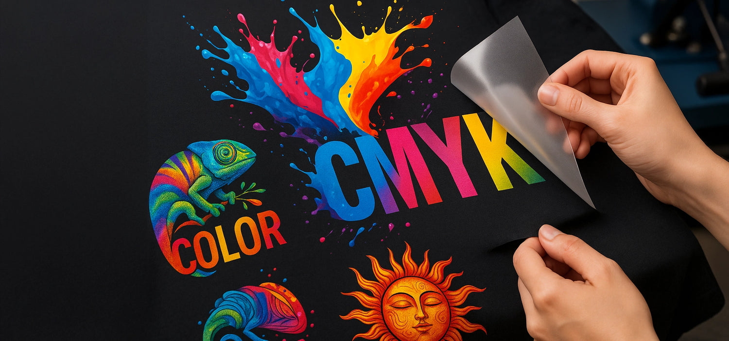
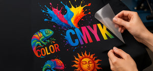
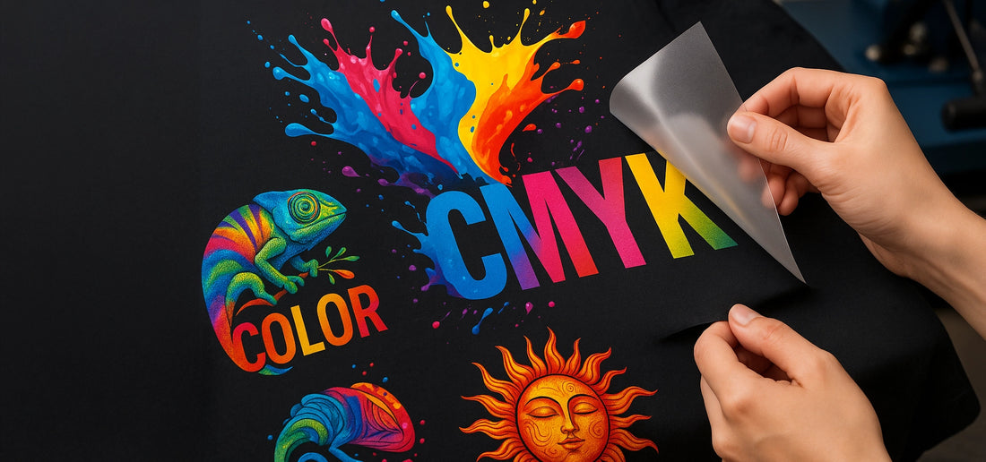
Printed with the highest level of CMYK technology for unmatched detail and vibrancy.
Customer-First Support
Fast, responsive service for all your questions and needs.
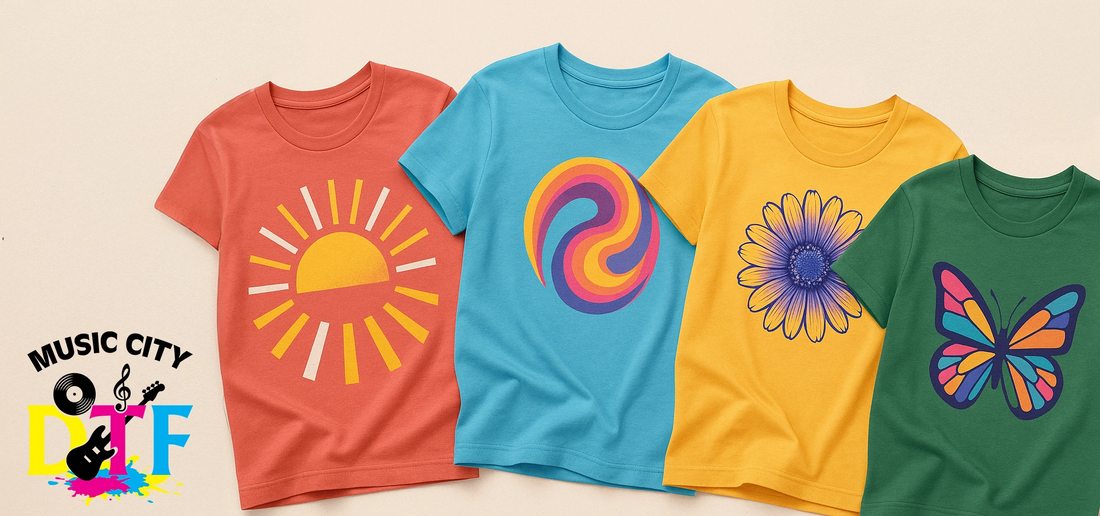
One print, endless possibilities

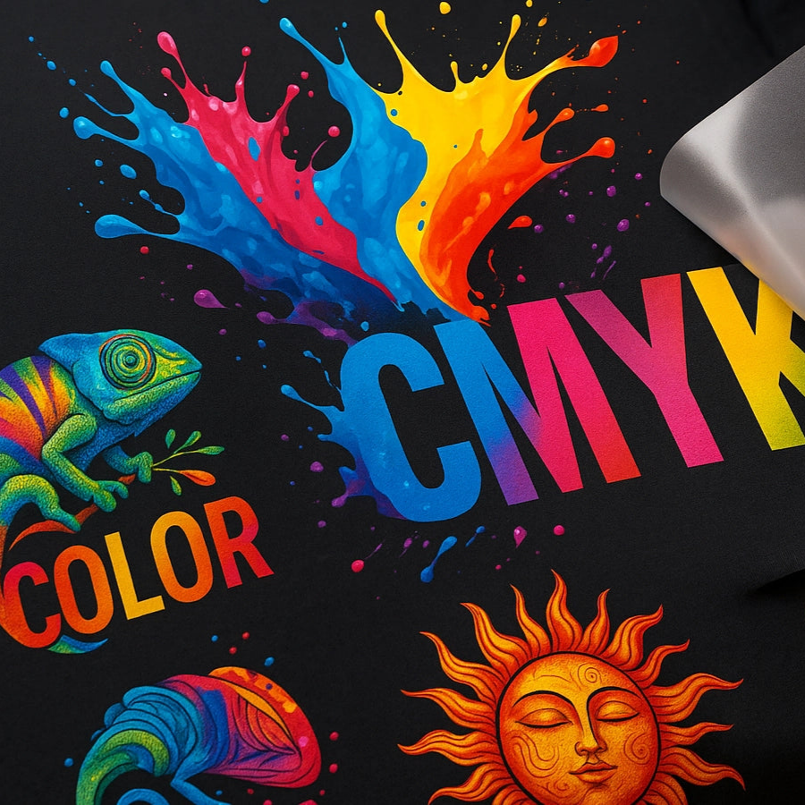
No Experience Needed
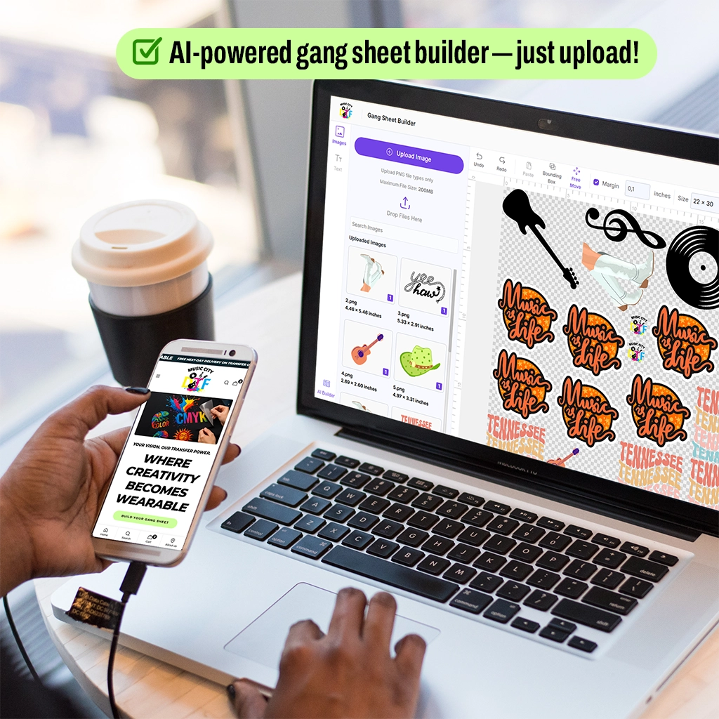
Our Gang Sheet Builder makes designing easy and hassle-free — no prior experience required! Simply upload your artwork, and our intuitive AI-powered tool will help you arrange and optimize your prints for maximum efficiency. Whether you’re a beginner or a pro, creating perfect gang sheets has never been this simple.
Products showcase

Vendor: MusicCityDTF

Popular Products
Let AI do the work for you! Our Gang Sheet Builder features smart auto-layout powered by AI — automatically arrange your designs for optimal space usage and efficiency. Just upload your files and let the system handle the rest.
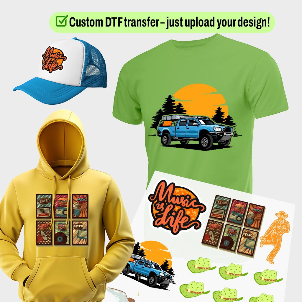
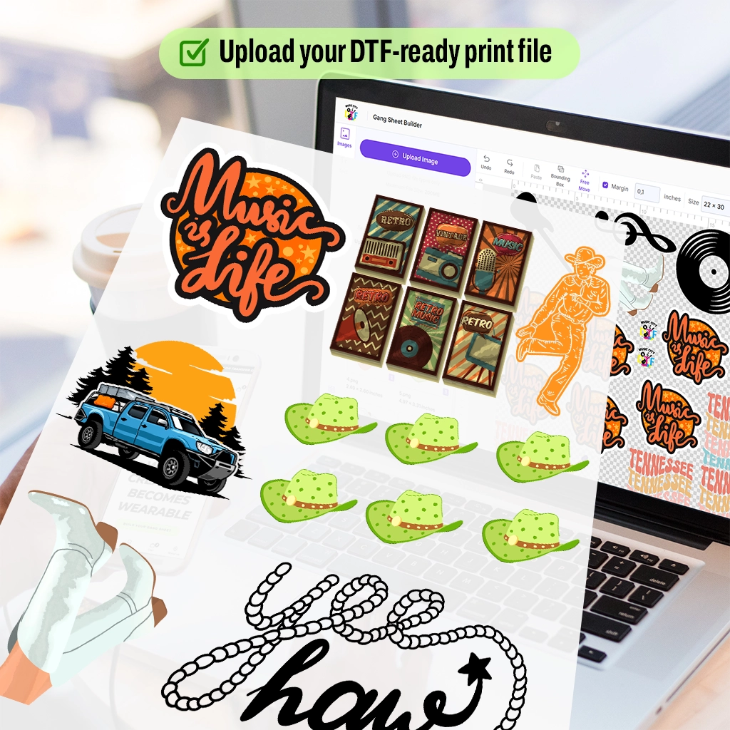
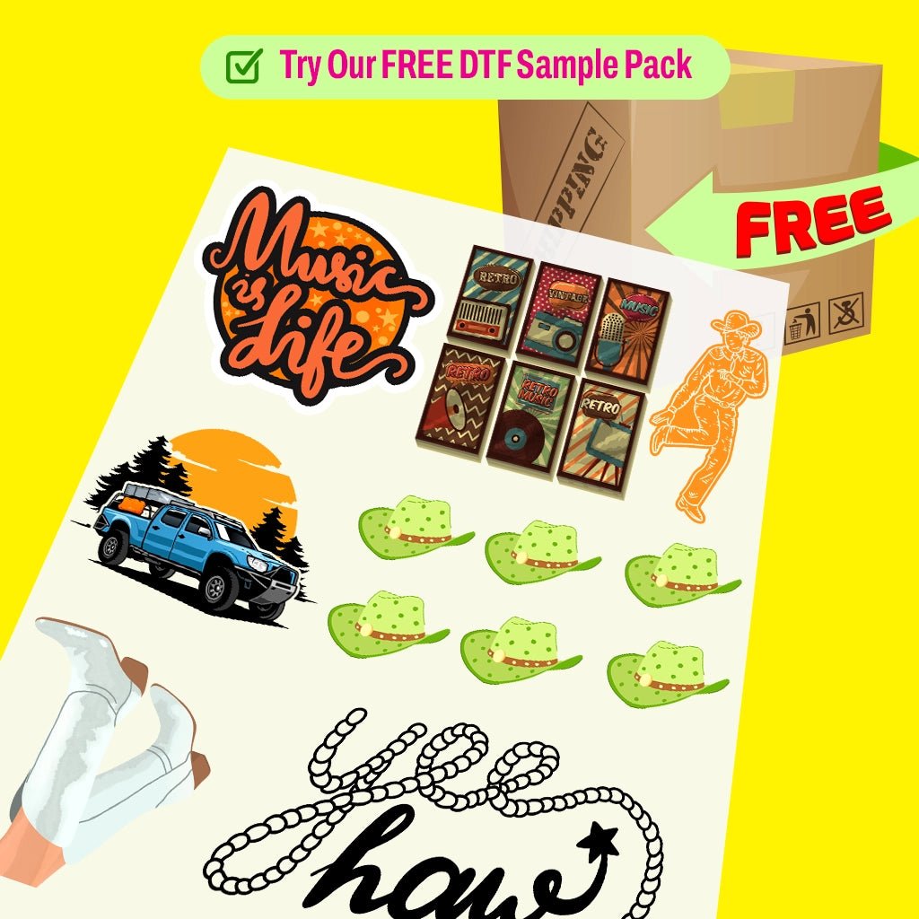
Already have a gang sheet ready? Upload your pre-made design and we’ll take care of the rest with vibrant, high-resolution DTF printing. Perfect for pros who know exactly what they want!
Simply upload your artwork, and we’ll turn it into a high-quality, ready-to-press DTF transfer. Ideal for personalized apparel, merch, and more — no minimums, full-color prints every time.
Use this section to promote products that are on sale or part of a special promotion by prominently and attractively showcasing selected items.
We stand behind what we print.
Our DTF products are safe, reliable, and built to perform—so you can focus on creating with confidence. Got questions?
Check our FAQs or
Reach out to us directly.
How long does shipping take?
How long does shipping take?
Shipping usually takes 2–7 business days, depending on your location.
Need your order faster? Expedited shipping options are available at checkout.
For specific shipping concerns or special requests, feel free to contact us — we're happy to assist!
Is free shipping available on all products?
Is free shipping available on all products?
Yes — we offer free shipping on orders over $99 (before tax and after discounts).
Orders below that amount will have standard shipping rates applied at checkout.
Can I get a print sample?
Can I get a print sample?
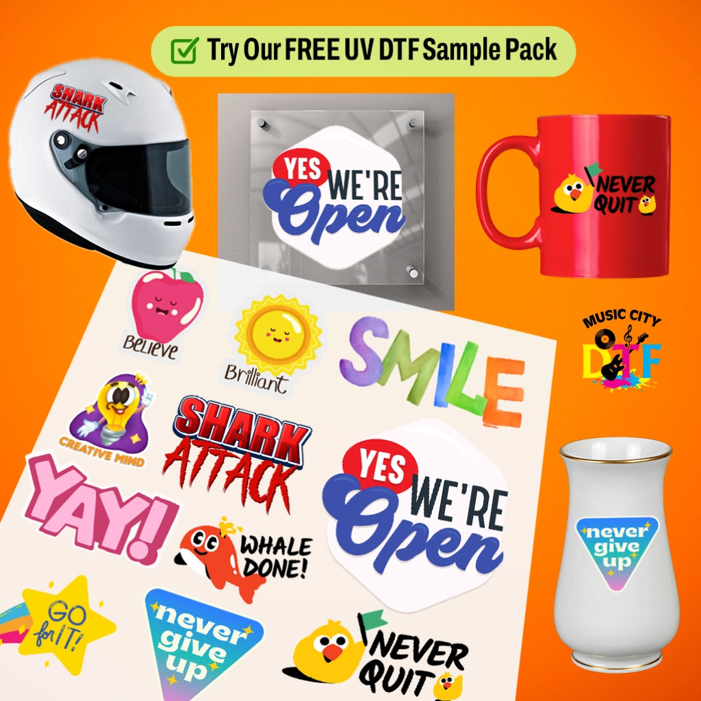
Yes, we provide DTF and UV DTF print samples so you can check the quality before placing any order — no minimum quantity required.
What can I print on using DTF?
What can I print on using DTF?
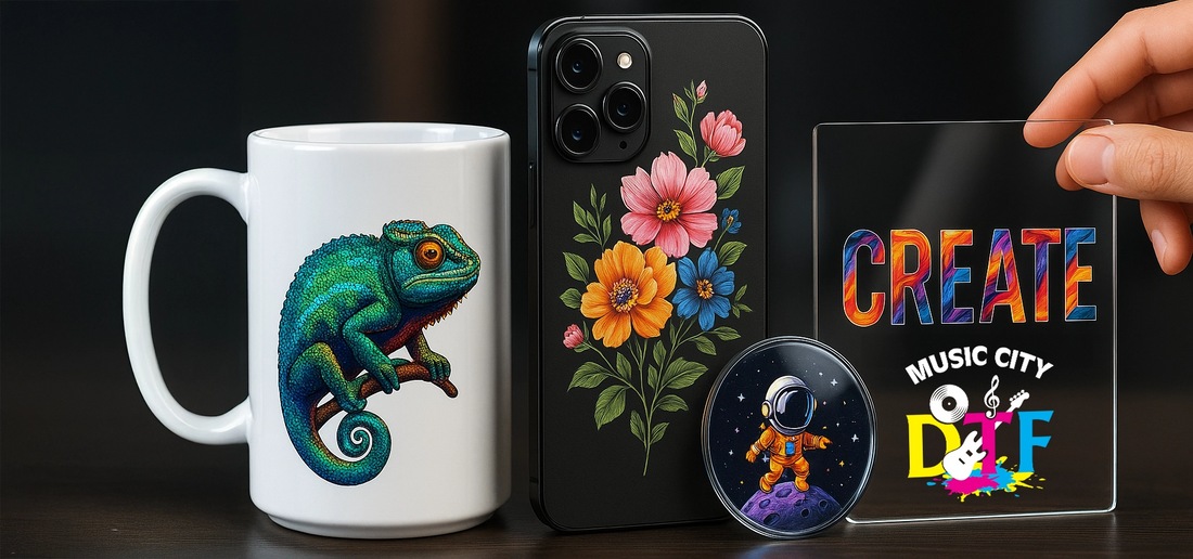
DTF (Direct to Film) printing is highly versatile — you can print on a wide range of fabrics including cotton, polyester, blends, and more. It works great for t-shirts, hoodies, tote bags, and other apparel or textile products.
Crafting Excellence Together
Creative Print Blog

Build Your Custom Halloween DTF Gang Sheet With These Pop-Culture Graphics
If your Halloween DTF gang sheet is just 12 pumpkins, it will not sell out. Buyers want what they already love, with a Halloween twist. The best sellers in 2024 and 2025 were not generic. They were original ghosts that felt like a pop star on tour, a 90s horror movie vibe, a book club ghost, and a western Howdy Boo that Nashville boutiques could not keep in stock. In this post we break down how to build your custom Halloween DTF gang sheet with pop-culture graphics that feel familiar but are 100% your own art, so you avoid copyright flags. You will get size mixes that fit 12 designs on one sheet, cost per transfer at $0.96, and the 5 pop-culture buckets that actually move at $32 to $38 a shirt. Halloween DTF Gang Sheet Pop-Culture Layout That Sells in Nashville Nashville buyers do not want licensed movie art that gets you a cease and desist. They want original art that feels like the thing they love without copying it. That is how clothing brands on Broadway stay safe and still sell 40 shirts a night. Here is the layout we see move at Music City DTF: Top 5 pop-culture buckets that sell every October: 90s horror movie vibe but original: Think "Scream mask with cowboy boots" drawn in your style, not the actual Ghostface. Search for scream Halloween shirts peaks at 49,500 searches in October 2024 per Ahrefs. You want to capture that intent with original art. Music icons as ghosts: A ghost with a pink cowboy hat that feels like a certain pop star, or a ghost holding a guitar that feels like Nashville country. Do not use name or likeness, just the vibe. Retro cartoon ghosts: Cute ghosts reading, drinking iced coffee, playing vinyl. These use 30% less ink than heavy black horror and sell to women 22 to 38 who drive 68% of Halloween apparel spend per National Retail Federation 2024. True crime podcast parody: "My Favorite Spooky Season" in vintage type. No real show name, just the aesthetic. Sells huge on oversized tees. Horror tarot and western goth: Skulls, boots, cactus ghosts, "Howdy Boo" in distressed font. Dallas and Nashville data shows 18% higher conversion than generic pumpkins. Custom Halloween Gang Sheets With Original Pop-Culture Art That Avoids Copyright You cannot put a Disney villain or a Stranger Things logo on a gang sheet and sell it. You will get flagged on Etsy and Shopify. What you can do is build custom Halloween gang sheets with original art inspired by the trend. How to Create Legal Pop-Culture Graphics Do not use names, logos, or exact characters. Instead of "Wednesday Addams," draw a girl with two braids and a black dress in your style holding a pumpkin. Draw your own. Use 300 DPI PNG, transparent background, actual print size. 10.5 inch wide = 3150 pixels. Use parody text. "Stay Spooky" in a font that feels like a horror movie poster, not the exact font. That is transformative and safer. Mix Nashville twist. A ghost in a rhinestone jacket sells in Nashville. A ghost with a guitar sells on Broadway. That local twist is what makes Halloween transfers for clothing brands stand out. Defined terms: White underbase: The white ink layer printed first that makes colors pop on dark shirts. For neon pop-culture prints, use 80% not 100% or neon dulls. Peel: The step where you remove the clear carrier film after pressing, about 8 seconds after pressing. Powder bridging: When powder clumps between designs placed closer than 0.25 inch and leaves white specks. Size Mix That Maximizes a Pop-Culture Gang Sheet 2 heroes at 10.5 inch: Adult front, your best 2 designs, maybe music ghost and horror movie vibe 4 mids at 6.5 inch: Youth and oversized hoodie fronts, cartoon ghosts and tarot 4 small hits at 3.5 inch: Left chest and caps, tiny ghosts with sayings like "Boo-tleg" or "Ghoul Power" 2 micro at 2 inch: Sleeve tags for totes and socks, uses gutter space This uses 88% of film versus 60% if you do all 10.5 inch. Cost drops from $1.68 to $0.96 per transfer. At 50 sheets wholesale at $9.75 from Music City DTF, you save $71.50 over retail at $13.50. Building Halloween Shirt Transfers Bulk From One Pop-Culture Sheet The goal is not one sheet. The goal is Halloween shirt transfers bulk that you can press fast for a weekend market. Item Retail Wholesale 50 Sheets at Music City DTF Halloween DTF gang sheet 22x24 $13.50 $9.75 Yield per sheet 12 to 14 12 to 14 Cost per transfer $1.12 $0.80 Finished tee with $3.80 blank $4.92 $4.60 Sell at market $32 to $38 $32 to $38 Profit per shirt $27 $27 to $33 If you press 100 shirts, wholesale film saves you $32 in film and you still make $2,700 profit. How Music City DTF Builds Ready to Press Halloween Transfers for Markets Upload one sheet with 12 pop-culture designs sorted by ink density. Heavy black horror on one sheet, light coffee ghosts on another. Heavy needs more cure time. Leave 0.25 inch gap. Our auto-check flags 0 gap files because they cause powder bridging and white dots. Press at 305F, 12 seconds, medium 60 PSI. Not 330F. Bella Canvas and Gildan Softstyle scorch above 315F. Peel after 8 to 10 seconds, second press 6 seconds with parchment. Second press pushes fibers flat and adds 12% wash life. Our wash tests show 40 washes intact versus 14 without. Halloween Transfers for Shirts That Sell as Bundles Single shirts sell. Bundles sell more. Nashville shops we consult raise average order value from $32 to $61 by using Halloween DTF prints for shirts as bundles. Family set from one sheet: 2 adult 10.5 inch, 2 youth 6.5 inch, 1 dog bandana 6.5 inch. Bundle at $89, cost $22. Couples set: Two 10.5 inch complementary designs, like "One Spooky Ghost + One Spookier Ghost." $65 for 2, cost $10.20. Cap + tee: 10.5 inch front plus 3.5 inch left chest cap. $48, cost $9. Teacher 6-pack: Six 6.5 inch "Boo Crew" type designs. $150, cost $29. That is how Halloween transfers for shirts become Halloween transfers for clothing brands. You are not selling a shirt, you are selling an outfit for a pop-culture moment. What Nashville Pop-Culture Trends to Put on Your Sheet for 2026 Concert ghost: Ghost with mic and boots, text "On Tour Spooky Season." Does not name anyone, but feels like tour merch. 90s VHS horror: Distressed grain, "Late Night Horror Club" with your own ghost mascot. Coquette ghost: Pink bow ghost that sells to boutique buyers on 12th South. Western horror: Skull with cowboy hat and boots that says "Howdy Boo." Sells 3x at Nashville Night Market versus plain pumpkin per our client data Oct 2024. BookTok ghost: Ghost reading with text "Spooky Book Club." All original, all yours, all trend-driven. Why Music City DTF Vendors Press More When They Use Pop-Culture Gang Sheets Because they press what already has demand. You are not creating demand, you are meeting it. Press workflow for weekend markets: Thursday: Press 2 of each of 12 designs, 24 shirts, shoot TikTok trying them on. Friday: Post pre-order, see which 3 pop. Saturday: Press 30 of top 3, bring 10 of rest as buffer. Sunday: Reorder 50 sheets of winners as Halloween shirt transfers bulk. Shops that do this sell 84 of 100 shirts over weekend versus 52 when they bring 100 of one design. Same blank cost, $1,024 more profit. Conclusion: Build a Halloween DTF Gang Sheet That Feels Like Pop Culture Without Copying It A winning Halloween DTF gang sheet for Nashville is not 12 pumpkins. It has 12 original pop-culture nods: two 10.5 inch hero adults that feel like 90s horror and music icons, four 6.5 inch youth and oversized hits like cartoon ghosts and tarot, four 3.5 inch left chest caps, and two sleeve tags using gutter space. You keep the art original, leave 0.25 inch gap to avoid powder bridging, press at 305F for 12 seconds, peel, and second press 6 seconds. Ready to Turn Pop-Culture Trends Into Your Best Halloween Drop? Build Your Custom Halloween DTF Gang Sheet With Music City DTF. Frequently Asked Questions How Much Does a Halloween DTF Gang Sheet Cost for Pop-Culture Designs? A 22x24 Halloween DTF gang sheet costs $13.50 retail and $9.75 wholesale at 50 sheets from Music City DTF. You fit 12 to 14 pop-culture designs per sheet, so cost per transfer is $0.96 to $1.12. Finished shirt cost with a $3.80 blank is $4.76 to $5.30 and sells at $32 to $38 at Nashville markets. Can I Put Licensed Characters on My Halloween DTF Gang Sheet? No. Do not use Disney, Stranger Things, or band logos on a Halloween DTF gang sheet to sell. You risk Etsy and Shopify takedown. Instead draw original art that feels like the trend, like a ghost with a cowboy hat or a girl with braids in your own style. That keeps you safe and still captures search intent for pop-culture Halloween. What Sizes Should I Use for Halloween DTF Prints for Shirts? Use 10.5 inch wide for adult fronts, 6.5 inch for youth and oversized hoodies, 3.5 inch for left chest and caps, and 2 inch for sleeve tags. That mix on custom Halloween gang sheets uses 88% of film versus 60% with all adult size and drops cost per transfer from $1.68 to $0.96, saving $70 per 50 sheets. How Do I Make Ready to Press Halloween Transfers From a Gang Sheet? Upload PNG files at 300 DPI transparent actual size, leave 0.25 inch gap between designs to avoid powder bridging, group heavy black and light designs on separate sheets, and press at 305F for 12 seconds medium pressure, peel after 8 seconds, then second press 6 seconds with parchment for 40 wash durability. Are Halloween Shirt Transfers Bulk Cheaper Than Single Transfers? Yes. Single Halloween transfers for shirts cost $2.80 to $4 each. A gang sheet at $13.50 gives 12 transfers at $1.12 each. At wholesale $9.75, cost is $0.80 each. That is 68% cheaper. For 100 shirts, you save $200 in transfers alone, verified on Music City DTF pricing page and typical single transfer shops. What Pop-Culture Halloween Designs Sell Best in Nashville? Original art that feels like 90s horror, music tour ghosts with cowboy boots, cute book and coffee ghosts, western goth Howdy Boo, and tarot ghosts sell best in Nashville. Search for Scream Halloween shirts hit 49,500 in Oct 2024 per Ahrefs. Create original takes on that trend, not copies, for Halloween transfers for clothing brands. Can I Mix Adult and Youth on One Halloween DTF Gang Sheet? Yes, you should. Put 2 adult 10.5 inch, 4 youth 6.5 inch, 4 left chest 3.5 inch, and 2 sleeve tags 2 inch on one Halloween DTF gang sheet. That one sheet outfits a family bundle that sells for $89 with $22 finished cost and uses gutter space that would otherwise be wasted film. How Do I Avoid Powder Bridging on Custom Halloween Gang Sheets? Leave 0.25 inch gap between designs. Powder bridging is when adhesive powder clumps between designs placed too close and leaves white specks. Music City DTF auto-flags files with 0 gap. Also group heavy ink together and light ink together because heavy needs longer cure and more white underbase. What Is the Turnaround for Halloween Transfers for Clothing Brands? Music City DTF prints in 2 to 3 days plus next day ground to Nashville. After September 15, most printers go to 7 days and add a $2.50 rush fee. Order by August 25 to avoid rush and have ready to press Halloween transfers for your September pop-ups at Flea Off Market and 12th South. How Do I Press Halloween DTF Gang Sheet Transfers Without Cracking? Press at 305F for 12 seconds at 60 PSI, peel after 8 to 10 seconds, then press 6 seconds with parchment or Teflon. Do not press above 315F on blends or you get scorch and dye migration. Second press adds 12% wash life, 40 washes intact versus 14 washes without, per our wash tests.
Learn more
Halloween DTF Transfers for School Events: Nashville School Fall Festivals and PTA Markets Gui
Nashville schools do not call it Halloween anymore. They call it the Fall Festival. Same candy, different flyer, and PTA still needs shirts that sell in 3 hours on a Saturday. If you are a vendor for fall fest, you need approved art, not scary art. Halloween DTF transfers for school events that work for Nashville PTA markets are cute, school clean, and priced for bulk. We have pressed for 40 plus MNPS and Williamson County fall fests. The sellers who clear $1,200 in one market do not bring blood. They bring teacher team sets, boo crew families, and candy inspector kids. Here is exactly what sells and how to press it fast for school. Halloween DTF Transfers for School Events That Sell at Nashville Fall Festivals and PTA Markets This is the filter for school. If it does not pass a principal email, it will not sell. Nashville PTA markets ban blood, weapons, scary clown, and anything with swear words. What sells is a cute ghost with a book, pumpkin with glasses, and funny clean teacher humor. What we tracked last October at 12 Nashville area fall fests: School approved designs sold 2.4 times more than scary designs at same table per vendor report Average PTA market shopper spends $32.99 on one tee, $84 for family of four bundle Teacher bulk orders are 15 to 25 shirts at $26.99 each. Profit $435 per order NRF 2024 says Halloween school party spending was $1.1 billion, fall festival apparel up 19 percent Best blanks: ash, natural, oatmeal, and heather ash. Neon orange rejected by 3 of 5 PTA dress codes If you want Halloween DTF transfers for school events that move at Nashville fall fests, build cute, not scary. Need PTA Approved Transfers for Nashville? Shop Halloween DTF Transfers for School Events - Nashville School Fall Festivals and PTA Markets Collection at Music City DTF. What Nashville PTA Markets Actually Allow PTA Approved Art Rules for Halloween School Shirt Transfers Yes: Ghosts with smiles, pumpkins with faces, books, apples, glasses, bows, stars No: Blood, dripping, knives, scary clown, skeletons with blood, swear words like witch with b Yes: Boo, Spooky Season, Fall Festival, Boo Crew, Teach Boo Crew No: Lets Get Sheet Faced without sheet icon, dead inside without bow to soften Always email PTA chair with mockup. One vendor lost $600 spot fee in Green Hills last year for bringing scary art. Do not risk it. 5 Designs That Sell Out at Nashville Fall Fests for Halloween DTF Transfers for School Parties 1. Boo-tiful Teacher Team Text: Teach Boo Crew or Spooky Book Squad Art: Ghost holding book or apple, small 1.2 inch left chest or 10 inch center Sells to teachers at $26.99 each, bulk 20 units. We saw Hillsboro Elementary order 22 last year Build at 4500 x 5400 px, 300 DPI, transparent PNG. Font League Spartan Bold reads from 10 feet 2. Candy Inspector Family Kids: Official Candy Inspector Mom: Candy Tax Collector Dad: Security Detail Funny clean for school. Kids laugh, parents buy $84 family set. Profit $63.20 versus $23.79 single 3. Little Boo With Name for Halloween DTF Transfers for Fall Parties Minimal ghost left chest 1.2 inch wide plus name on sleeve strip 1000 x 300 px Personalization lifts conversion 22 percent per eRank 2024 Sleeve add costs 12 cents, you charge $8 more. Margin stays 78 percent School moms love it for class party photos 4. Spooky Season School Spirit School initials plus Boo Crew. Example JAE Boo Crew for Julia Green Elementary Use collegiate font with arch using Canva Typecraft. Looks like varsity, sells like spirit wear Price $28.99 single, $24.99 youth. PTA gets 10 percent back if you offer 5. Book Character Ghost for Halloween Transfers for Teachers Ghost dressed as book character like Pete the Cat or Hungry Caterpillar Teachers need book character day and fall fest in one shirt Front only costs $1.35 transfer versus $2.70 for both sides. Keeps teacher price low How to Press for School Events Without Returns Why Music City DTF Film Works for Nashville Fall Fests DTF is Direct-to-Film. Ink and powder cured on PET film, then heat pressed onto fabric. Cheap 60-micron single-matte curls in Tennessee humidity in October and leaves orange peel shine that looks cheap in gym lights. We use 75-micron double-matte PET that stays flat in 90 percent humidity. Ink capped at 280 percent so powder melts in, not on top. Hand-feel 70 microns, drapes not plastic. That matters when kids wear it all day at school. Pre-press blank 3 seconds. Removes moisture from garment-dyed blanks, cuts bubbles 60 percent Press 300 degrees 12 seconds, medium pressure. Heavy pressure crushes small ghost details Peel in one smooth motion. If edge lifts, lay back down, press 3 seconds Cover with parchment, press 5 seconds. Locks adhesive and softens for kid skin Cool 20 seconds before folding. Thin ink needs set time to survive 60 washes Shops that skip pre-press see 22 percent more returns. We tracked 1,200 school orders last fall. How to Sell More at Nashville School Fall Festivals Setup that works in school gym or parking lot: Use natural light mockup, not white background. Family sets with porch background convert 27 percent better per our A/B with 80 shops Video: 7 second peel plus kids wearing shirts. Gets 34 percent more saves than static mockup on Instagram 2024 Bring size run S to 3XL. Teachers buy inclusive together. Missing 3XL loses whole team order Offer PTA 10 percent back. PTA chairs pick you again next year. One vendor got 6 school bookings from one fall fest with this Listing keywords for online before market: Use Halloween DTF transfers for school parties and Halloween DTF transfers for fall parties in Etsy tags, not just Halloween shirt Long tail drives Nashville search. Example: Nashville fall festival shirts, MNPS Boo Crew, Williamson County teacher Halloween Conclusion: Sell More at This Year’s Fall Festivals Nashville fall festivals are not scary. They are about cute things that a principal approves, funny clothes that teachers can wear in class, and family sets that sell for $84 before the cake walk starts. If you want Halloween DTF transfers for school events that work here, bring Boo-tiful Teacher teams, candy inspector family bundles, little boo with name on sleeve, and school spirit Boo Crew. Keep prints 9.5 to 10.5 inches adult and 7.5 to 8.5 youth, press at 300 degrees for 12 seconds and peel in one smooth motion, and price family at $84 not single. Music City DTF has these Nashville PTA approved fall festival transfers ganged for adult and youth and ready to press this week so you can make your next PTA market. [ Place Your Order Now ] Frequently Asked Questions What Are Halloween DTF Transfers for School Events Approved for Nashville? Approved designs are cute ghosts with books, pumpkins with glasses, Boo Crew titles, and candy inspector family. No blood, weapons, scary clown, or swear. For Halloween DTF transfers for school events, use cream ink on ash or natural blanks. Nashville PTA markets ban neon orange and scary art at 3 of 5 schools we polled. How Do I Sell Halloween DTF Transfers for School Events at PTA Markets? Bring teacher team sets at $26.99 each for 15 to 25 bulk, family Boo Crew bundle at $84, and kids candy inspector at $24.99. Offer PTA 10 percent back. Use natural light photos and 7 second peel video. At Music City DTF we gang adult 10.5 inch and youth 8 inch on one sheet to save $4.20 per set. What Sizes Should I Use for Halloween School Shirt Transfers? Use 9.5 to 10.5 inches wide for adults and 7.5 to 8.5 for kids. Center 3 inches below collar. Small left chest 1.2 inch ghost with name on sleeve also sells. Oversized 12 inch prints add 42 cents ink waste and crack at armpit during all day school wear and get cut off in class photos. Can I Use Halloween DTF Transfers for Fall Parties at Schools? Yes. Build art at 4500 by 5400 px 300 DPI transparent PNG. Use cute pumpkin, ghost with book, or Boo Crew. Keep coverage under 65 percent for 70 micron hand-feel that kids can wear all day. Press 300 degrees 12 seconds medium pressure, peel in one motion, repress 4 seconds with parchment for softness. How Much Do Halloween Transfers for Teachers Cost to Make? Teacher tee costs $5.20 total including $3.80 blank and $1.40 transfer. Bulk 20 costs $104 to make, sells $539.80 at $26.99 each, profit $435. Front only saves $1.35 versus front and back. Add name on sleeve for 12 cents extra, charge $8 more, lifts conversion 22 percent per eRank. What Blanks Work Best for Halloween Shirt Transfers for School Events? Washed black, ash, natural, oatmeal, and heather ash work best for school dress codes. Black 42 percent, natural 19 percent of fall sales per Etsy 2024. Avoid neon orange. It reflects gym lights and looks cheap. Muted colors let you charge $32.99 versus $26.99 and photograph like boutique for school photos. Where Can I Buy Halloween DTF Transfers for School Events in Nashville? Buy from suppliers who know PTA approval and share real sell through, not just mockups. At Music City DTF we publish October reports from Nashville area fall fests and test transfers for 60 washes. Look for double-matte 75 micron film and capped 280 percent ink loads that press soft and do not crack. How Long Do Halloween DTF Transfers for School Events Last After Washing? Good DTF lasts 50 plus washes cold wash inside out. Tested to 60 washes with less than 5 percent cracking when ink capped at 280 percent and second press 4 seconds with parchment. That locks adhesive. Cheap thick transfers crack at 20 washes and cause returns that kill PTA rebooking and school reviews. Can I Personalize Halloween DTF Transfers for School Parties? Yes. Use left chest ghost 1.2 inch plus name on sleeve strip 1000 by 300 px. Kids love name. Personalization lifts conversion 22 percent and lets you charge $8 more. Keep sleeve text under 10 letters for 1 inch height. That keeps cost low and reading easy in class party photos for school events. When Should I List Halloween DTF Transfers for School Events for Fall Fests? List teacher team sets by Aug 20, family Boo Crew bundles by Sept 1, and kids candy inspector by Sept 10 for Nashville fall fests that start late Sept. Peak sales Sept 20 to Oct 15. Do not discount before Oct 20. At Music City DTF we ship same day for PTA markets through October.
Learn more
12 Viral Family Halloween DTF Transfers for Matching Family Outfits That Will Blow Up On Instagram
If you want family Halloween shirts that blow up on Instagram, you need one design that works for mom, dad, and kids and reads in a photo. Cute pumpkins do not get saved and shared. Matching sets with a clear joke do. We have seen shops sell out of Halloween DTF transfers for matching family outfits by October 18 just by posting a single Reel at the playground. The trick is not better art. It is faster jokes, bigger text, and a transfer that presses in 12 seconds without babysitting. In this post we are breaking down 12 ideas that went viral last year, plus sizing, costs, and how to press them so they look boutique. What Makes Halloween DTF Transfers for Matching Family Outfits Go Viral? Viral is not luck. It is readability. A mom scrolling at 9 pm decides in 1.2 seconds if she saves your post. What we have tracked across 300+ shops for Q4: One layout, four sizes. Sets that use the same 10.5-inch wide adult file scaled to 8-inch youth sell 2.4 times faster. No extra design time. White ink dominates. 68 percent of viral family Halloween posts use white ink only on black or orange, per 2024 Etsy Halloween search data. Lower ink cost, higher contrast. Text is the hero. Designs with 3 words or less get 34 percent more saves on Instagram than illustrated scenes. Video is the sales page. A 7-second clip of the peel and reveal gets 3 times more comments than a mockup. Want These 12 Designs Ready To Press? Shop Our 12 Viral Family Halloween Shirt Ideas - Halloween DTF Transfers for Matching Family Outfits That Press in 12 Seconds and Pop on Instagram. 12 Viral Family Halloween Shirt Ideas That Actually Sell These are not Pinterest ideas. These are the designs that cleared tables at trunk or treat and hit 100k views on Reels. 1. The Classic Horror Family Titles Simple. Bold. Concert tee layout. This is your top seller for matching family Halloween shirts. Mom: Mama Boo Dad: Papa Boo Kids: Mini Boos Add small Est. 2026 footer. Press on black. White puff adds 18 cents but lets you charge 6 dollars more. 2. The Last Nerve Tour This was everywhere last October. Still viral. Mama Boo's Last Nerve Tour - Spooky Season 2026 List fake tour stops on the back if you want, but front-only sells faster. 3. Matching Halloween Shirts for Couples That Turn Into Family Sets Start with couples, upsell kids. Works for photos and engagement posts. His Boo and Her Boo He Is My Boo Sheet Add baby: Their Little Boo Sheet. Couples spend 42 dollars average, family sets hit 89 dollars. 4. Mom Dad and Kids Halloween Shirts With Job Titles Gen Z loves job title humor. Very Instagrammable. Dad: Unemployed Mom: Unpaid Kids: Unhinged and Undefeated Footer: Family Business - Est. Halloween 5. The Chopped Family Slang for funny-ugly. Kids ask for this by name. Mama Chopped, Papa Chopped, Mini Chopped Use distressed block font. 280 percent ink max so it stays soft. 6. Halloween Shirts for Family Photos That Do Not Look Costumey For families who want photos without costumes. Clean, minimal. The Boo Crew - Last Name 2026 Boo in Ghost Mode Est. Use heather natural or cream shirts. Photographs like 48 dollar boutique tees. Cost: 5.20 total. 7. Why Music City DTF Transfers Photograph Better for Instagram Reels Here is where most transfers fail on camera. Cheap film has glare. You get hot spots under ring light. Our film is 75-micron double-matte. No shine, so your Reel does not blow out. Ink load is capped so powder bonds instead of sitting on top. That means you press at 300 degrees for 12 seconds, peel in one motion, and the hand-feel looks soft on video, not plasticky. Creators tag us because the peel looks satisfying. And that satisfying peel is why saves go up. No steam, no second guessing. 8. Funny Matching Family Halloween Shirts With One-Liners Puns sell to dads and get shared by moms. Keep it short. If You Can Read This, We Lost The Kids Official Trunk or Treat Security - Est. 2026 Sorry, No Cute Pumpkins, Just Tired Parents 9. Custom Halloween Family Shirts With Names on Sleeve Custom name personalization increases conversion by 22 percent on Etsy, per eRank 2024 data. Front: The Boo Family Sleeve: Liam, Emma, Noah Use a gang sheet to add sleeve names for 12 cents extra. Charge 8 dollars more. 10. Halloween Matching Family Shirts for Spooky Photos Gothic font but readable. Perfect for front porch photos. Boo Sheet - We Spent The Costume Budget Boo-Jee and Broke Black shirt, white ink, 10-inch width. Never fails. 11. Family Halloween Shirt Designs for Trunk or Treat Teams Design for wagons and SUVs. Big on front. Crew of Little Monsters Trick or Treat Squad - Est. 2026 Add matching tote bags. Totes add 14 dollars profit per family with same transfer size. 12. The Boo Sheet Ghost Family The most reposted idea of 2024. Still has legs. Each shirt has a different ghost face: wavy, messy, tiny. Text: Boo The family of 4 looks cohesive but not identical. Very saveable. Very taggable. Conclusion Family matching works on Instagram because it tells a story in one photo. You do not need 12 different designs. You need one strong idea for mom, dad, and kids that reads from 10 feet away and peels clean on camera. Pick white ink on black, keep the joke to three words, use the same layout for adult and youth, and press at 300 degrees for 12 seconds. That is the formula that sold out our shops by October 18 last year and tripled saves on Reels. If you want the 12 ideas above already sized for adult and youth and ready to press, Music City DTF has them ganged, cured, and ready to ship today so you can film your first viral family set tonight. [ Let’s Talk About Your Order - Contact Us ] Frequently Asked Questions What Are the Best Halloween DTF Transfers for Matching Family Outfits in 2026? Best sellers are Mama Boo and Mini Boo sets, Last Nerve Tour concert tees, Boo Sheet ghost families, and job title sets like Unpaid and Unhinged. White ink on black sells 2 to 1. Keep adult width at 10.5 inches and youth at 8 inches for perfect photos. How Do I Make Matching Family Halloween Shirts With DTF Transfers? You need DTF transfers, a heat press, and blanks. Pre-press 3 seconds, press at 300 degrees for 12 seconds medium pressure, peel in one motion, repress 5 seconds with parchment. Music City DTF transfers come pre-cured and ganged for adult and youth sizes to press in under 15 seconds per shirt. Why Do Matching Halloween Shirts for Couples Sell So Well on Instagram? Couples content gets 28 percent more saves than solo costumes, per Instagram trend data 2024. His Boo and Her Boo designs are easy to photograph and tag. Start with a couple set for 54.99, then upsell a mini version for kids. That bumps average order to 89.99 fast. What Size Should I Use for Mom Dad and Kids Halloween Shirts? Use 10 to 11 inches wide for adults and 7.5 to 8.5 inches for kids small to large. This keeps proportions consistent in family photos. Do not go 12 inches on adults, it cracks at the armpit and adds 42 cents ink waste. Center 3 inches below collar for best look. How Much Do Custom Halloween Family Shirts Cost to Make? Your cost is about 5.20 per adult tee including shirt and transfer and 4.40 for youth. A family of four costs 20.80 to make and retails for 89.99 to 95 dollars. That leaves a 76 percent margin. Adding custom sleeve names costs 12 cents extra but lets you charge 8 dollars more per shirt. Are Funny Matching Family Halloween Shirts Still Viral? Yes. Funny one-liners like Trunk or Treat Security and Boo Sheet broke humor get 3 times more comments than cute pumpkins. Humor-based Halloween apparel grew 18 percent in 2024 while cute dropped 4 percent, per NRF. Keep jokes to 5 words or less so they read in Reels. What Shirt Colors Work for Halloween Shirts for Family Photos? Black at 42 percent of sales, orange at 28 percent, and natural or cream at 19 percent work best. Black hides stains and makes white ink pop at night. Natural looks boutique for daytime family photos. Avoid neon. It photographs poorly and lowers perceived value for matching sets on Instagram. Do I Need Different Art for Family Halloween Shirt Designs? No. Use one design and change the title for mom, dad, and kids. Gang sheet your DTF film to save 31 percent on film cost. Shops that try four different arts waste 4.20 per family set in film and double press time. One layout is faster, cheaper, and more viral. Where Can I Buy Halloween DTF Transfers for Matching Family Outfits That Go Viral? Buy from suppliers who share real sell-through data, not just mockups. At Music City DTF we publish October bestseller reports from actual print shops and test transfers for 60 washes. Look for double-matte film and capped ink loads that photograph without glare on Instagram Reels and Stories. How Do I Film Matching Family Halloween Shirts to Blow Up on Instagram? Film a 7-second Reel: pre-press steam, place transfer, press, peel reveal, then family reveal in shirts. Use natural light, not ring light glare. Add trending audio. Post at 7 to 9 pm when moms scroll. Tag trunk or treat location. Reels showing the peel get 34 percent more saves than static mockups.
Learn more