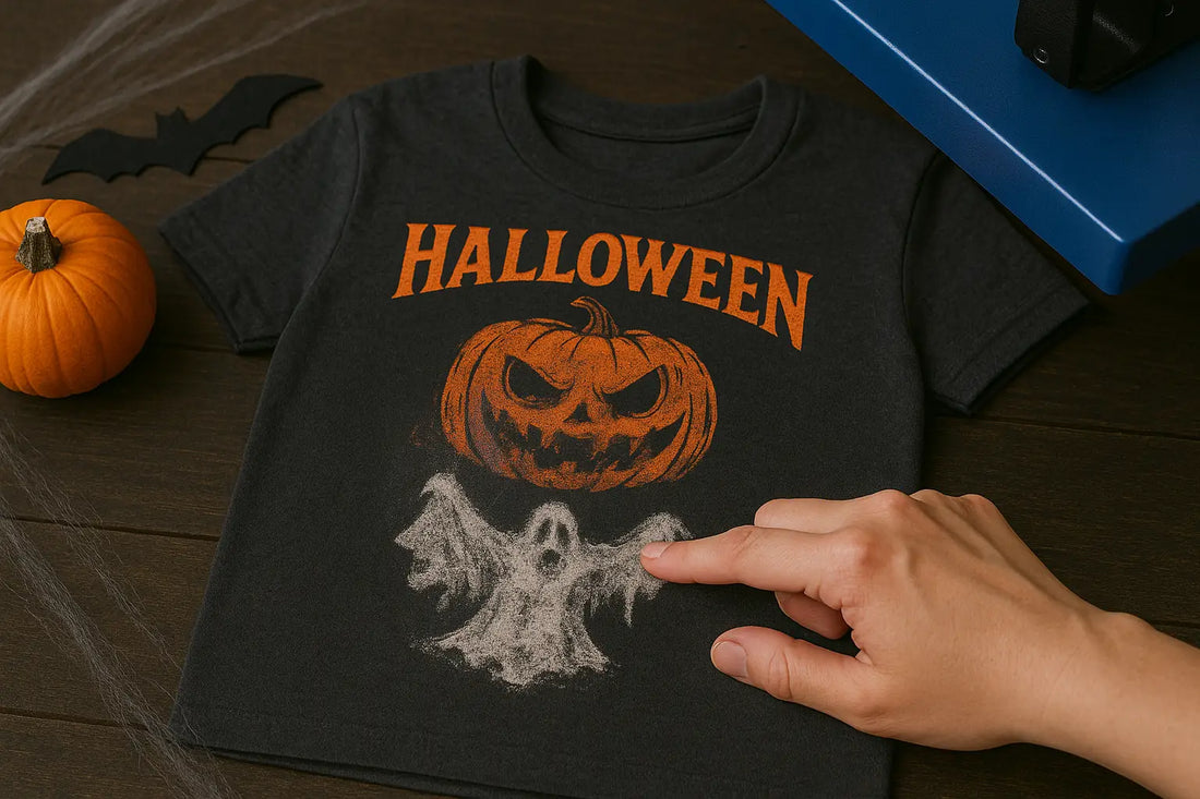
Among the most aggravating issues DTF print shops experience is DTF color mismatch. You work for hours crafting the ideal artwork only to find out later that it looks muted, off-hue, or just inconsistent with the original. From screen calibration and application settings to ink and curing techniques, DTF printer color management almost always underlies the problem. Understanding how DTF color correction works can save you hours of wasted time, film, and materials, whether you're new to direct-to-film printing or looking to enhance your method.
This guide clarifies, in a step-by-step manner, exactly why your colors might not match and how to resolve the issue. To achieve prints that look as excellent on fabric as they do on your screen, we will review the most common causes and remedies for DTF transfer color problems.
DTF Color Mismatch: Problems to Consider
1. Your Monitor Isn’t Calibrated
Your DTF print looks different from the design? It could be the monitor. If your monitor isn’t calibrated, you’re essentially setting yourself up for failure right from the start. Every screen’s got its weird quirks—one’s too blue, another’s got the brightness that is too much. You have to use a colorimeter and actually calibrate the device. Set it to sRGB or Adobe RGB and adjust the brightness and white point until the image appears as desired. This is the foundation of color calibration for DTF printing.
2. You’re Not Using an ICC Profile
No ICC profile? You’re essentially playing color roulette and hoping that your printer, ink, film, and RIP all work together seamlessly. Spoiler: they won’t. That’s how you end up with colors that are either too bright or too dull. An ICC profile is a data file that specifies exactly how colors are intended to appear when printing, provided you’re using that particular setup. Always obtain the ICC profile from your ink or film supplier, or create a custom one if possible. It’s not optional if you want your DTF colors to match screen output.
3. Your RIP Settings Are Off
RIP software is the translator between your beautiful digital art and what comes out of your printer. If your settings are even a smidge off—white ink too heavy, color channels swapped, or poor resolution, your print is going to look off. Don’t trust the defaults. Run some tests, adjust the settings, and determine the optimal color settings for DTF printing that work best with your setup. One tiny tweak can be the difference between “wow!” and “yikes.” RIP settings are where the magic (or disaster) happens.
4. You're Using the Wrong Ink or Film Combo
One of the primary reasons why DTF colors look dull is the quality of the ink. Not all inks and films are compatible with each other. Maybe your cyan is a little off, or the film coating melts weird under heat—suddenly, your colors are all over the place. Additionally, cheap films either ruin your colors entirely or become distorted in the heat. Stick to one brand if possible, and ensure your ICC profiles match.
5. Your Print Environment Isn’t Stable
Have you ever tried printing when it’s super humid? Powders and inks don’t cure properly. Even how your film dries can change the color. Try to maintain a print room temperature of around 70–75°F and a humidity level of 45–60%. If your prints look different every day, your environment is likely inconsistent. Don’t blame the printer—blame the weather. This helps eliminate the screen vs print color difference caused by environmental changes.
6. You’re Over or Under Curing
Curing isn’t just about making the powder stick. Too little heat and your print looks faded. Too much and you’ll get weird yellowing, especially in whites and pastels. Grab an infrared thermometer and check if your press is hitting the right temp—usually 320°F, give or take. Proper curing is essential for DTF color accuracy. Follow the powder manufacturer’s instructions instead of just guessing. Proper curing = colors that last.
7. File Format and Color Mode Problems
Designing in the wrong color mode can also lead to DTF color mismatch. Always work in RGB, but remember: your RIP will convert it to CMYK or any other color space your printer uses. Use Photoshop or Illustrator to soft-proof in CMYK if you want to see how it’ll print. Save your files as TIFF or PNG—JPEGs just mess up gradients and fine lines. Adjusting colors in DTF begins with selecting the correct mode and format from the outset.
8. You’re Ignoring Test Prints
Skipping test prints? That’s a rookie move. Do a quick 4x4” swatch before you waste a roll of film and fifty-dollar ink. Compare it to your screen, note what’s off, tweak, repeat. Yes, it’s a bit extra work, but it’ll save you from having to discard an entire batch. This step is key when learning how to fix DTF color issues and avoid waste.
9. Your Art Has Too Much Saturation or Contrast
Sometimes, your printer isn't the problem—it’s your artwork. Some designs look fantastic on a backlit screen, but printers just can’t handle that much color. Neon, ultra-black, and other intense colors usually become a mess. Dial it back a bit, consider print design, and select colors that your printer can reproduce. Keeping saturation in check can prevent many DTF transfer color problems.
Why Choose Music City DTF?
If you’re after color accuracy and solid prints, Music City DTF is the way to go. We’ve got top-notch inks, films, powders, and everything in between. Starting or scaling up? Doesn’t matter. Our crew’s got your back, and shipping’s fast: reliable gear, real support, and no delays. Try our color chart today to start creating prints that accurately represent your artwork.
Final Thoughts
Let’s be real: dialing in DTF color isn’t magic—it’s a grind. You have to tweak, test, and use the right stuff. From screen calibration to getting the cure just right, every little bit counts. Skip the guesswork, lock in a process, and you’ll get eye-catching prints that look exactly how you imagined. To avoid DTF color mismatch, it's essential to make a deliberate effort to calibrate your monitor, configure your setup, and select colors that are compatible with your printer. When everything is done correctly, you will never mix up colors again!