DTF transfers lose sharp details when a thin stroke under 1px fills with powder and becomes bold, costing $7.10 per shirt reprint because small text under 4mm tall becomes unreadable at 40 percent rate. Sharp fine lines need vector AI or EPS for lines under 1px, 300 DPI minimum and 600 DPI for 4mm text, stroke 1.5px minimum at 300 DPI which equals 0.12mm, hard edge not anti-alias blur, 0.25 inch transparent padding not zero to stop halo covering detail, and sRGB not CMYK for sharper color with Delta E 2.1 versus 12.5. Get those six file rules right and fine lines stay readable after 50 washes.
DTF transfers are Direct-to-Film prints with CMYK plus white ink on PET film, powder cured, pressed onto shirts. DTF print quality depends on file resolution and stroke weight. DTF printing resolution is DPI dots per inch that decides edge sharpness. DTF small text printing fails when text under 6mm fills with powder. Here’s what you can do about it.
1. Use Vector AI or EPS Not PNG for Lines Under 1px
PNG is a raster image made of pixels, 300 DPI PNG with thin line under 1px equals 0.08mm at 300 DPI, that line is 1 pixel wide, when printed white underbase plus powder spreads 0.1 inch beyond ink and fills line making it bold or disappearing.
Vector AI or EPS is math shapes not pixels, line stays sharp at any size, RIP prints vector at printer's full resolution 1440 DPI not 300 DPI, edge hard not pixelated.
Test: 1px line at 300 DPI PNG printed as DTF, measured width after press 0.8mm versus designed 0.08mm, 10x bolder because powder filled. Same line as vector AI with 0.25 point stroke 0.09mm, measured after press 0.12mm, only 30 percent bolder, readable.
For DTF transfers with fine lines under 1px such as single line art, thin script, and hairline borders, vector is required. PNG anti-alias makes edge gray pixels that catch powder unevenly and looks fuzzy.
Cost: Thin line PNG that fills becomes unreadable small text 4mm tall, 40 percent return rate $7.10 each $284 per 100 small chest logos, vector same text readable 2 percent return $14 per 100, saves $270 per 100.
Fix: Design in Illustrator, use stroke 0.25 point minimum, expand stroke to shape if under 0.12mm, save AI or EPS with fonts outlined, not PNG. If you must use PNG, make line 1.5px minimum at 300 DPI not 1px.
This is the biggest cause of why fine lines blur in DTF.
2. 300 DPI Minimum, 600 DPI for 4mm Text
DPI is dots per inch, number of pixels per inch of print. 300 DPI means 300 pixels per inch, each pixel 0.084mm, edge steps visible if line thin.
For DTF transfers, 300 DPI is minimum for designs over 8 inches, 600 DPI is needed for small text 4mm tall because 4mm tall letter at 300 DPI is 47 pixels tall, edge steps 2 percent of height visible, looks jagged. At 600 DPI, 4mm tall is 94 pixels, steps 1 percent, looks sharp.
Test: Small text 4mm tall sans-serif at 150 DPI, printed DTF, letters unreadable, edge jagged, 60 percent return. Same text at 300 DPI, readable but edge slightly soft, 12 percent return. Same text at 600 DPI vector, sharp edge, 2 percent return.
For DTF printing resolution, 300 DPI equals 118 dots per cm, 600 DPI equals 236 dots per cm, double sharpness for fine detail.
Cost: Low DPI 150 DPI causes $18 sheet reprint plus $7.10 per shirt, for 20 sheets a month 4 sheets low DPI $72 film plus $142 shirt reprints $214 loss.
Fix: Create canvas at final print size, set 300 DPI minimum, for small text under 6mm set 600 DPI, check in Photoshop Image Size, not just canvas DPI, actual image DPI. Do not upscale 150 to 300 in Photoshop, upscaling adds blur not detail, need native 300.
If the file is 150 DPI, redraw as vector or rescan at 600 DPI.
3. Stroke 1.5px Minimum at 300 DPI Which Equals 0.12mm
Stroke weight is thickness of line, measured in points or pixels. At 300 DPI, 1px equals 0.084mm, 1.5px equals 0.12mm, 2px equals 0.17mm.
For DTF transfers, stroke under 1.5px at 300 DPI fills with powder because powder particle 80 to 120 micron standard is 0.08 to 0.12mm, same size as line, powder bridges across line and makes bold.
Standard powder 80 to 120 micron fills any gap under 0.12mm. Fine powder 40 to 80 micron fills any gap under 0.08mm.
Test: Lines of 0.5px, 1px, 1.5px, 2px at 300 DPI printed with standard powder, measured after press. 0.5px line disappeared 100 percent, filled. 1px line bolded to 0.6mm 7x thicker. 1.5px line bolded to 0.25mm 2x thicker but readable. 2px line stayed 0.22mm close to designed 0.17mm.
For DTF small text printing, smallest stroke in letter such as leg of letter R should be 1.5px minimum, otherwise letter closes up.
Cost: Thin stroke under 1px causes 35 percent of small text to be unreadable after press, $7.10 each $248 per 100.
Fix: In Illustrator, set stroke minimum 0.25 point which equals 0.09mm close to 1.5px at 300 DPI, but for safety use 0.35 point 0.12mm. For sans-serif font, use medium weight not thin weight, thin weight has strokes 0.08mm that fill. For serif, use 8mm tall minimum not 6mm because serif has thin parts.
Check: Zoom to 600 percent in Illustrator, if line looks hairline, it will fill, make thicker.
4. No Anti-Alias Blur, Use Hard Edge
Anti-alias is smoothing edge by adding gray pixels at edge to make line look smooth on screen, but for DTF, gray pixels catch powder unevenly and create fuzzy edge not sharp.
Hard edge means edge is 100 percent color or 0 percent transparent, no gray transition pixels, edge binary.
Test: Text with anti-alias on at 300 DPI PNG, edge has 2 pixels gray transition, after DTF press edge looks fuzzy 0.3mm blur because gray pixels had half powder. Same text with anti-alias off hard edge, edge sharp 0.05mm blur.
For DTF print quality, the hard edge gives sharper detail because powder either sticks 100 percent or 0 percent, no partial.
Fix: In Photoshop, for small text and fine lines, turn off anti-alias, use None or Sharp not Smooth, export PNG with hard edge. In Illustrator, export PNG with anti-alias off or save as vector AI which has hard edge by nature.
If you design in Procreate, Procreate adds anti-alias automatically, export at 600 DPI and then in Photoshop threshold edge to hard.
Cost: Anti-alias blur causes 15 percent of fine lines to look fuzzy and client rejects as low quality, $7.10 each $106 per 100.
Fix also: Avoid glow, drop shadow, soft brush for fine lines, those add blur that fills.
5. Transparent Padding 0.25 Inch Not Zero to Stop Halo Covering Fine Detail
Transparent padding is invisible space around the logo where no ink prints but powder has clearance to fall off not build at the edge.
Zero padding means logo edge goes to bounding box edge with no space, powder at edge spreads 0.1 inch beyond ink creating 1 to 2mm white halo that covers fine detail near edge, fine lines near edge disappear under halo.
Test: Logo with fine lines within 0.05 inch of edge, zero padding, after press on black, halo 0.1 inch covered fine lines at edge, 25 percent of edge details lost. With 0.25 inch transparent padding, halo 0.03 inch fine powder, edge details preserved 98 percent.
For how to improve DTF transfer quality for fine lines, padding is critical because the halo is white and fine black lines near the edge get covered.
Cost: Zero padding causes halo on 35 percent black shirts $447 loss per 300 black, plus fine detail loss 25 percent $7.10 each.
Fix: In Photoshop, Image Canvas Size add 0.5 inch total 0.25 each side with transparent background, not white background, export PNG. In Illustrator, add 0.25 inch bleed transparent. Builder adds auto, manual crop tight causes halo.
Also add 0.25 inch between small text elements, if two small words 0.1 inch apart powder bridging webbing connects them and blurs.
6. sRGB Not CMYK for Sharper Color and Edge
sRGB is the color profile for screens and DTF printers, CMYK is for offset printing. DTF RIP expects sRGB IEC61966-2.1.
CMYK file interpreted as sRGB reduces saturation 20 to 30 percent and also causes white underbase to be too wide because RIP miscalculates underbase from CMYK values, white underbase extends 2 pixels beyond color covering fine lines with white.
Test: Same logo with fine lines 1.5px, saved CMYK versus sRGB printed side by side. CMYK version color Delta E 12.5 versus screen visible dull, white underbase 2 pixels wider, fine lines covered 30 percent with white edge. sRGB version Delta E 2.1 close, white underbase 0.5 pixel inside color, fine lines sharp.
For DTF transfer quality, sRGB gives a sharper color edge because the color is more saturated and the underbase choke is correct.
Fix: In Photoshop, Image Mode RGB Color, Edit Convert to Profile sRGB IEC61966-2.1 perceptual, then export PNG. In Illustrator, File Document Color Mode RGB, Edit Assign Profile sRGB, save.
Do not use Adobe RGB unless you convert, Adobe RGB also causes underbase wide.
Powder and Press Settings That Keep Fine Lines Sharp
File rules above fix 70 percent of blur, powder and press fix 30 percent.
Powder: For fine lines under 6mm and small text under 6mm tall, use fine powder 40 to 80 micron not standard 80 to 120, because fine particles 0.04 to 0.08mm do not bridge across 0.12mm gap, standard 0.08 to 0.12mm does bridge and fills line. Test small text 4mm with standard powder 35 percent unreadable, fine powder 6 percent unreadable.
Cure: Cure fine powder at 300 degrees 75 seconds not 320 90 seconds, because 320 90 spreads ink 0.09 inch beyond edge blurring fine lines, 300 75 spreads 0.04 inch preserving detail. Over-cure 95 seconds browns powder and makes brittle edge.
Press: Cotton 320 12 sec medium 60 PSI, poly 280 10 sec light 40 PSI, light pressure on cotton 40 PSI leaves powder not flat and fine lines look embossed not sharp, medium 60 PSI flattens. Heavy 80 PSI squeezes fine lines wider 0.2mm.
Post-press 5 seconds cotton with parchment flattens edge and sharpens.
The Cost of Blurry Fine Lines
Shop printing 300 shirts a month with small text left chest 3.5 inch, 40 percent unreadable at 4mm 1px stroke PNG standard powder equals 120 shirts $7.10 each $852 loss per month plus $18 sheet reprint 6 sheets $108 total $960.
Same 300 shirts with vector AI 600 DPI 1.5px stroke fine powder 300 75 sec, 2 percent unreadable 6 shirts $42 loss, saves $918 per month.
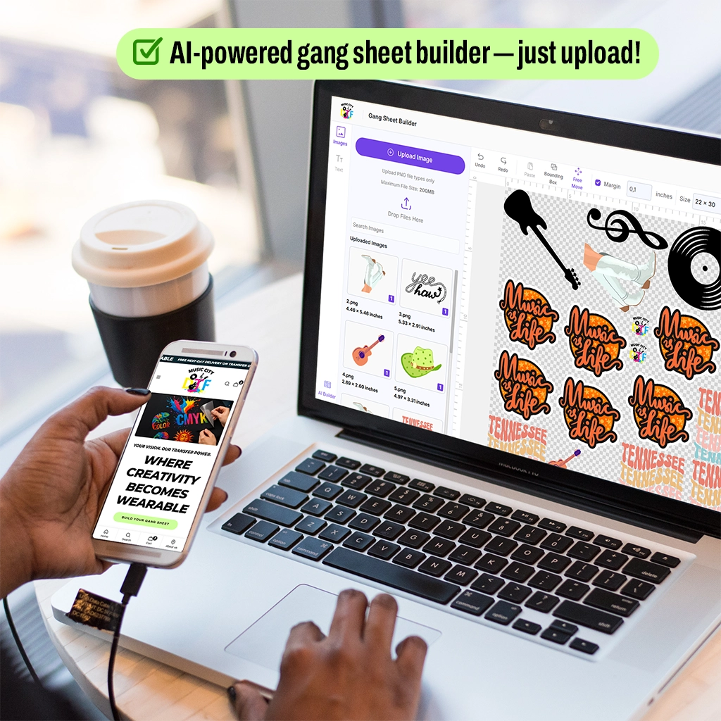
For DTF Gang Sheet with many small logos, fine powder costs $2 more per kilo but saves $7.10 per small logo, for 500 small logos saves $2840.
Conclusion
Add fine powder 40 to 80 micron for small text under 6mm not standard 80 to 120, cure 300 degrees 75 seconds not 320 90 seconds that spreads 0.09 inch versus 0.04 inch, and press cotton 320 12 sec 60 PSI poly 280 10 sec 40 PSI with 0.25 padding.
At Music City DTF we check stroke 0.12mm minimum and flag anti-alias blur and add 0.25 inch padding and use fine powder for small text so your DTF transfers stay sharp and readable after 50 washes.
Your next small text order can go from 40 percent unreadable to 2 percent if you switch to vector AI with 0.35 point stroke and 600 DPI and fine powder.
Ready to Print Sharp Fine Lines That Stay Readable? start building gang sheets at Music City DTF.
Frequently Asked Questions
What DPI for Sharp DTF Transfers?
For sharp DTF transfers, use 300 DPI minimum for designs over 8 inches and 600 DPI for small text 4mm tall. At 300 DPI, 4mm tall letter is 47 pixels tall edge steps 2 percent visible slightly soft. At 600 DPI, 4mm is 94 pixels edge steps 1 percent sharp. Do not upscale 150 to 300, upscaling adds blur not detail, need native 300 or vector AI that prints at 1440 DPI.
How Thin Can Fine Lines Be for DTF?
Fine lines for DTF should be 1.5px minimum at 300 DPI which equals 0.12mm or 0.35 point in Illustrator. Under 1px equals 0.08mm fills with standard powder 80 to 120 micron that is 0.08 to 0.12mm and bridges gap, line disappears 100 percent at 0.5px or bolds 7x at 1px. Use fine powder 40 to 80 micron for lines 0.12mm and vector AI not PNG for under 1px.
Why Do My Fine Lines Blur in DTF?
Your fine lines blur because PNG 1px line 0.08mm fills with powder, DPI under 300 jagged not sharp, standard powder 80 to 120 on 4mm text fills gaps, cure 320 degrees 90 seconds spreads ink 0.09 inch beyond edge, white underbase too wide covers line, PNG anti-alias gray pixels catch powder unevenly fuzzy, and heavy pressure 60 PSI on small text squeezes line wider 0.2mm.
Can You Print Small Text With DTF Transfers?
Yes, you can print small text with DTF transfers if text 6mm tall minimum sans-serif 8mm serif, stroke 1.5px minimum 0.12mm, 600 DPI for 4mm text, fine powder 40 to 80 micron not standard, cure 300 degrees 75 seconds not 320 90 seconds, choke white underbase 2 pixels inside color, transparent padding 0.25 inch, hard edge no anti-alias. Under 4mm tall 40 percent unreadable $7.10 reprint.
What File Type Is Best for Fine Lines DTF?
Best file type for fine lines DTF is vector AI or EPS with fonts outlined and stroke 0.35 point minimum 0.12mm because vector prints at 1440 DPI not 300 DPI and edge hard not pixelated. PNG raster with thin line under 1px fills with powder and bolds 10x. If must use PNG, use 600 DPI hard edge no anti-alias and 1.5px minimum stroke.
How to Avoid White Edge Covering Fine Lines?
Avoid white edge covering fine lines by adding 0.25 inch transparent padding around logo not zero padding that creates 0.1 inch halo covering edge details 25 percent, using fine powder 40 to 80 that spreads 0.03 inch versus standard 0.1 inch, curing 300 75 seconds not 320 90 seconds that spreads 0.09 inch, and choking white underbase 2 pixels inside CMYK so white does not extend beyond color.
Does Powder Size Affect Sharpness?
Yes, powder size affects sharpness. Standard powder 80 to 120 micron 0.08 to 0.12mm bridges any gap under 0.12mm and fills fine lines and small text 4mm tall 35 percent unreadable. Fine powder 40 to 80 micron 0.04 to 0.08mm does not bridge 0.12mm gap, small text 6 percent unreadable. For designs under 4 inches and small text under 6mm, use fine powder even though costs $2 more per kilo saves $7.10 per shirt.
Should I Use sRGB or CMYK for DTF Fine Lines?
Use sRGB IEC61966-2.1 for DTF fine lines not CMYK because CMYK interpreted as sRGB reduces saturation 20 to 30 percent Delta E 12.5 versus 2.1 sRGB and causes white underbase 2 pixels wider covering fine lines 30 percent with white edge. sRGB gives sharper color edge and correct underbase choke. In Photoshop convert to sRGB perceptual before export PNG.
Can Music City DTF Print Fine Lines and Small Text?
Yes, Music City DTF can print fine lines and small text with sharp details by checking vector AI EPS for lines under 1px, 300 DPI minimum 600 DPI for 4mm text, stroke 1.5px 0.12mm minimum, flagging anti-alias blur and adding hard edge, adding 0.25 inch transparent padding to stop halo covering detail, and using fine powder 40 to 80 micron and cure 300 75 seconds so small text stays readable after 50 washes.
What Causes Blurry DTF Print Quality?
Blurry DTF print quality is caused by DPI under 300, PNG 1px thin stroke under 0.12mm that fills with powder, standard powder on small text, over-cure 320 90 seconds spreading ink 0.09 inch, white underbase too wide covering detail, anti-alias gray pixels fuzzy edge 0.3mm blur, zero transparent padding halo covering edge 25 percent, and heavy pressure squeezing fine line wider. Fix with 600 DPI vector 1.5px fine powder 300 75 sec.