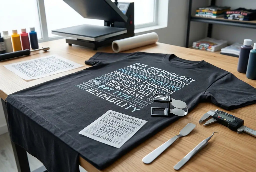
Tiny letters are where *DTF transfers for small text* either look pro or fall apart. You press a shirt, step back, and that little tagline under the logo is gone. Blurry, cracked, or just missing. And customers notice small text first because they lean in to read it.
If you can nail small text, you can print anything. Business cards on shirts, care lines, little website URLs, all that stuff stays readable. DTF is Direct-to-Film, where your design is printed on film and then pressed onto fabric. Big letters hide mistakes. Small letters show everything.
So if you're asking *how small can text be on DTF* and how to keep it sharp after washes, you're in right place. In this post we'll break down 10 simple design tricks that keep tiny letters clean, from size and font choice to spacing and press.
1. Stop Going So Small - 8 Pt Is Your Safe Spot for Minimum Text Size for DTF Transfers
Everyone tries to go tiny. Like 5 pt tiny. Then wonders why it vanished.
For sans serif like Arial or Montserrat, stay at 8 pt or bigger at actual print size. Serif like Times needs 9 to 10 pt because those little feet snap off. At the left chest, 8 pt is about 0.11 inch tall. That's small but it holds.
If you're asking how small can text be on DTF, 6 pt is absolute floor and only for bold sans serif. Even then you need perfect file and press. So bump it. Your client won't notice 1 pt bigger, but they will notice blurry.
Takeaway: Print it on paper at actual size before you send it. If you can't read it on paper, you won't on a shirt.
Tiny Text Coming Out Blurry? We Fix It Before Print
Upload your file to Music City DTF and we check size, add a little stroke, and print DTF transfers for small text that stays readable. Get a free file check today.
2. Pick Fonts That Were Actually Made for Small Size
Some fonts were made for big headlines. They look cool at 72 pt and terrible at 8 pt.
Good for small: Montserrat, Helvetica, Gotham, Inter, Open Sans, Futura Bold. Thick, even strokes all around. Bad for small: thin script, hairline fonts, anything where stroke goes super thin then thick.
For DTF small text printing, even stroke wins. Script fonts have those thin connectors that break after one wash.
Takeaway: Use script for big words only. Use sans serif for the small line underneath. Looks better and lasts longer.
How Music City DTF Tests Fonts for DTF Transfers Small Lettering
We keep a test sheet. Same phrase at 12 pt, 10 pt, 8 pt, 6 pt. Press on black and white cotton, wash once. What stays readable at 6 pt we keep, what cracks we drop. That one sheet has saved us hours and shows why the best font size for DTF transfers depends on the font family, not just the number.
3. Add a Tiny Stroke So Thin Letters Get Thicker
This one saves so many jobs.
Add 0.2 to 0.5 pt stroke in the same color as text. In Illustrator, select text, add stroke, set to outside, same color as fill. Don't go heavy or letters blob together.
For small text DTF printing, that little stroke adds just enough ink so powder sticks. Thin letters without it lose dots.
Takeaway: Try before and after at actual size. It goes from fragile to solid without looking bold. It takes 10 seconds.
4. Give Tiny Letters More Air
When letters are crammed, they stick together on film.
Increase letter spacing, tracking, by 25 to 75 in Illustrator or Canva. That's like 2% to 7% more space. If you have two small lines stacked, add 20% line spacing.
For how to print small text with DTF, space matters as much as size. Crowded text traps powder and peels as one blob. Then it looks like one thick line.
Takeaway: Select your small block, bump tracking to 50. Read it again. Way easier, and it stays separate after washing.
5. Don't Use Light Gray or Yellow for Tiny Text
Tiny text in light gray or yellow on white disappears. Tiny text in solid black on black with only white edge fails too.
On white shirts, use 100% black or dark navy for tiny letters. Dark holds better. On black shirts, use white at 80 to 90% density, not 50%. Light white looks gray and breaks. Yellow ink is thinner and fades fastest at small size.
For DTF transfers for small text, small dots have less ink, so light colors fade first.
Takeaway: If design needs light color small text, make it 1 pt bigger or add stroke from trick 3.
6. Keep Small Text Off Seams and Bumpy Spots
Seams, collars, thick hoodies make small text crack.
Place tiny legal lines at least half inch away from collar and side seams. On hoodies, avoid small text over center seam or pocket edge. The press is uneven there and tiny letters lift.
For minimum text size for DTF transfers, location changes everything. Small text over seam needs to be bigger because pressure isn't even.
Takeaway: Move tiny text to flat area, center chest or just below. If it has to be near the seam, bump 1 pt.
7. Outline Your Text and Clean It Up
Live text can shift fonts when you send a file. And it can have extra points that make edges wobbly.
Select text, create outlines in Illustrator. That turns letters into shapes. Clean stray points. Too many points around tiny letters makes edges blurry.
This helps DTF transfer small lettering stay sharp because the printer reads shape, not font.
Takeaway: Keep live text file for editing, but send outlined file for print. Every time.
Get Your Small Text Checked Before You Waste a Blank
Small letters failing costs $8 to $12 per blank. Send your design to Music City DTF and we fix spacing, size, and stroke so your DTF transfers for small text presses clean and stay readable.
8. Use a White Choke So You Don't Get White Halo
White underbase is white ink under color that makes color pop on dark shirts. If white is the same size as tiny letters, you see white edge.
Make white 1 to 2 px smaller than color. That's called a choke. Hides white peek. For white small text on black, use 80 to 90% white, not 100%, for a softer feel but still solid.
This is huge for minimum font size for DTF transfers because at 6 to 8 pt, a white halo looks bigger than the letter itself.
Takeaway: Ask your printer for a 1.5 px choke on small text. Keeps letters crisp without that white outline.
9. Gang Small Jobs Together and Press Right
You don't need new powder for small text, just right press.
Press cotton 310 to 320F, 13 to 15 seconds, medium-heavy, peel, then second press 5 to 7 seconds with parchment. The second press locks small letters. Press poly 280 to 290F, 10 to 12 seconds, light-medium, to avoid dye bleed that makes tiny letters fuzzy. Don't yank peel, smooth peel.
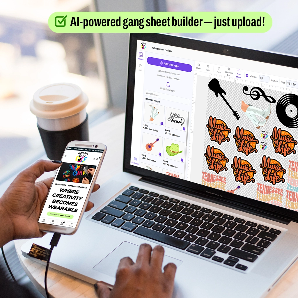
Cost wise, a 22 by 60 inch gang sheet is $14 to $22. You can fit 40 to 60 left chest small text logos. That makes each $0.35 to $0.55 instead of $4.50 single. So fixing a file once saves the whole gang.
Takeaway: Tape temp card to press: Cotton 315F 14 sec, Poly 285F 11 sec, second press 6 sec. New staff won't burn tiny letters.
10. Proof It on Paper at Real Size
The best trick is the oldest.
Print design on paper at actual print size. Not zoomed on screen. Real size. Read it at arm's length. If you squint, your customer will squint. Show proof to client on tee mockup. They often say make it bigger when they see real size.
For how small can text be on DTF and how to print small text with DTF, paper proof answers fast. Screen lies. Paper doesn't.
Takeaway: Keep a cheap laser printer near your computer. Print small text jobs before sending to DTF. 30 seconds, saves $50 in reprints.
Conclusion: Small Text Is Where You Prove You Are Good
Anyone can print big block letters. But DTF transfers for small text that stay readable after washes, that's where you earn trust. Customers lean in, read that little tagline, and decide if you're pro or not. And if that tagline is blurry, whole shirt looks cheap.
Keep it simple. Use 8 pt or bigger, pick even stroke fonts, add tiny strokes, give space, use solid colors, stay off seams, outline text, choke white, press right, proof on paper. Do those and your DTF small text printing stops failing.
You don't need fancy RIP tricks. You need good file habits. Five minutes fixing the file saves $8 to $12 per blank and a return. And you get shirts people actually wear and read.
If you want a small text that reads, send it to Music City DTF and we'll make it sharp before we print.
Frequently Asked Questions
How Small Can Text Be on DTF and Still Be Readable?
For most fonts 8 pt is safe. Bold sans serif can go to 6 pt. Serif needs 9 to 10 pt. At left chest 8 pt equals about 0.11 inch tall. Below 6 pt letters lose powder and crack. Always test at actual size on paper first and add 0.2 pt stroke for thin fonts to hold.
What Is the Minimum Text Size for DTF Transfers for Business Logos?
Minimum is 8 pt for sans serif, 9 to 10 pt for serif. If the logo has a tagline under the brand name, make tagline at least 8 pt. Legal lines and websites need 7 to 8 pt bold. Music City DTF recommends bumping taglines 1 pt bigger than client files because they shrink on shirts and blur.
What Is the Best Font Size for DTF Transfers With Tiny Lettering?
Best is 10 to 12 pt for care text, 8 to 10 pt for taglines, 6 to 8 pt only for bold short words. DTF transfers for small text stay sharp when you use even stroke fonts like Montserrat or Inter. Avoid thin scripts under 12 pt because thin connectors break after wash.
How Do I Fix Blurry Small Text in DTF Small Text Printing?
Make text bigger to 8 pt, add 0.2 to 0.5 pt stroke the same color, increase letter spacing to 50 tracking. Convert to outlines and export PNG 300 DPI sRGB. Press cotton 315F 14 sec with second press 6 sec and smooth peel so tiny dots stay and don't lift.
Can You Print Very Small Legal Text With DTF Transfers Small Lettering?
Yes, but keep it bold, 7 to 8 pt minimum, add stroke, give space. Legal text crammed too tight sticks together on film and peels as a blob. Increase line spacing 20% and tracking 50. Place away from seams. Music City DTF prints legal lines daily at 8 pt with choke so white halo doesn't show.
Why Does My Small Text Crack After Washing?
Cracking comes from no second press, thin font, or too light color. Press the second time 5 to 7 seconds with parchment to lock ink. Use 80 to 90% white on black, not 50%. Use bold sans serif not hairline. Wash cold inside out. Without a second press cracking starts wash 6, with it past wash 40.
How to Print Small Text With DTF on Black Shirts So It Pops?
Use white at 80 to 90% density, add 1 to 2 px choke so white doesn't peek, press 310 to 320F 13 to 15 seconds medium-heavy, smooth peel, second press. White small text needs to be solid, not light gray. Avoid yellow small text on black, it looks fuzzy. Keep letters spaced.
Do I Need Different Settings for DTF Transfers for Small Text Versus Big Logos?
Same press temps. Cotton 310 to 320F, poly 280 to 290F. Difference is file prep: bigger size, stroke, spacing, choke, and second press is mandatory for tiny letters. Small text shows mistakes that big logos hide, so spend 5 extra minutes on file, not on press settings.
What File Type Is Best for Small Text DTF Printing?
PNG, 300 DPI, sRGB, transparent if needed, text outlined. Keep a file over 2000 px wide for the left chest. Avoid low quality JPEG, it adds artifacts around tiny letters that look like dust. Keep master file with live text for edits and outlined file for print.
Does Music City DTF Check Small Text Files Before Printing?
Yes. Upload your design, we check DTF transfers for small text for size, font, spacing, and stroke. We fix halo with choke and adjust white density so small letters stay sharp. You get press-ready transfers labeled by size that press clean the first time without reprints.