You know that sweatshirt you see in a boutique window and you just assume it costs a lot? It usually does not cost that much to make. It just looks like it does. The fabric feels heavier. The print sits flat. The colors look intentional. And that is the whole trick.
Most Thanksgiving sweatshirts miss that mark because the blank is too thin, the print is too small, or the colors fight each other. Fix those three things and the whole sweatshirt changes. That is what these Thanksgiving DTF transfers are built to do when you pair them with the right Custom Gildan T-Shirt 64000 and the right press habits.
If you want a design that already looks boutique before you even press it, start with a transfer that is made for thick fabric. You get a clean, full-color print that lays down smooth and stays soft, which is half the battle with sweatshirts. And when the print feels soft, customers think the sweatshirt costs more.
Why Thanksgiving Sweatshirts Sell Better When They Look Expensive
People buy Thanksgiving sweatshirts for photos, for family dinner, and for gifts. They want to look put together, not like they grabbed a last-minute shirt. When your sweatshirt looks boutique, you can charge boutique prices and customers still feel good about it.
That is why Thanksgiving DTF transfers for sweatshirts work so well. They let you print detailed turkey art, pumpkin lettering, and family names in one press without the stiff, plastic feel. And when you use a good blank for your tee version, customers notice the difference in hand feel right away. A good feel is what makes them come back.
Trick 1: Pick a Blank That Feels Expensive Before You Print
The Fabric Does Most of the Work
A boutique sweatshirt starts with weight. Hold it in your hand and it should feel solid, not flimsy. Look for a brushed fleece inside and a smooth outside. That smooth outside is what makes your print look sharp.
Thin blanks wrinkle, show every crease, and make the print look like it is floating. Heavy blanks hold their shape, drape better in photos, and survive washes without going baggy. And that is what customers remember when they put it on again.
- Look for a cotton and poly blend with a brushed inside
- Skip thin, shiny, or super stretchy blanks that shift while you press
- Test this by washing one blank first. If it pills or shrinks a lot, do not use it for orders
Takeaway: If the blank feels cheap in your hand, no print will save it.
Thanksgiving Sweatshirts That Look Like Boutique, Not Craft Fair
Ready To Make a Collection? Shop DTF Transfers for This Fall Occasion
These are the transfers your customers will actually wear past Thanksgiving. Clean prints, soft feel, and easy presses that do not crack or peel after a few washes.
Loved this list? Read this next:
Trick 2: Print Bigger Than You Think You Should
Small Prints Make Sweatshirts Look Like Promo Tees
This is the mistake I see the most. Someone puts a tiny design in the middle of a large sweatshirt and wonders why it looks cheap. Boutique brands go big. They fill the chest. They let the design breathe.
For adult sweatshirts, aim for a print that is wide and centered, a few inches down from the collar. For youth sizes, scale it down but keep the same placement. The goal is balance. The design should look like it belongs there, not like an afterthought.
- Adult sweatshirts work best with a wide, centered, and bold print
- Youth sweatshirts should keep the same layout, just smaller
- Family sets should use the same design across sizes so photos look matched
Takeaway: When in doubt, go one size bigger on your transfer. It will look more intentional in photos.
Trick 3: Use Colors That Match the Season, Not Fight It
Tonal Color Is the Boutique Secret
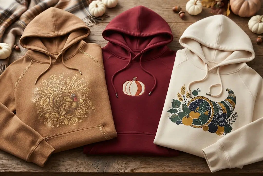
Boutique brands rarely use bright, clashing colors. They use tones that feel like fall. Cream on forest green. Burnt orange on black. Warm brown on cream. Those combos look expensive because they look calm.
When you pick Thanksgiving shirts and sweatshirts for your shop, build your color palette first. Pick two or three blank colors that work for the whole family and stick to them. That way your photos look cohesive and your inventory stays simple.
- Best combos that always sell are cream ink on forest green, burnt orange on black, and brown on cream
- Combos to avoid are bright red on bright green, neon on white, and too many colors in one design
- The photo tip is to shoot your sweatshirts in natural light. Tonal colors look even richer that way
Takeaway: Pick your blank color first, then pick ink colors that sit close to it. Contrast is good. Clash is not.
Trick 4: Give the Design a Soft, Worn In Finish
The Vintage Look Sells for a Reason
A brand new, super glossy print can look stiff on a sweatshirt. A slightly soft, vintage finish looks like it has been loved. That is why so many boutique Thanksgiving designs use a distressed texture or a faded effect.
You do not need to do anything fancy. Choose a design with a little texture in it. When you press it, it will settle into the fabric and look like part of the sweatshirt, not sitting on top of it. Customers love that feeling because it does not feel like a sticker.
- Choose designs with a little distressing or soft edges
- Avoid super solid, blocky designs with hard edges on fleece
- Press tip is to use a cover sheet and press once more for a few seconds to settle the print
Takeaway: A soft finish makes a simple sweatshirt feel like a boutique sweatshirt.
Want That Soft Boutique Feel on Every Press?
Ready To Make a Collection? Shop DTF Transfers for This Fall Occasion
These Thanksgiving sweatshirt transfers are made to press smooth, stay soft, and hold up through family photos, dinners, and washes. No stiff feel, no cracking.
Loved this list? Read this next:
Trick 5: Press It Like You Mean It, Then Press It Again
The Second Press Is What Makes It Last
This is the step that separates a sweatshirt that looks good on day one from one that still looks good on day thirty. After your first press, peel the film and then press again for a few seconds with a cover sheet. That second press pushes the print into the fibers and removes that shiny, fresh printed look.
It also helps with hoodies and thick sweatshirts where the seams and pockets can create uneven pressure. Take a second to smooth the area, use a pressing pillow if you have one, and make sure the whole design gets even heat.
- First press is to apply the transfer as you normally would
- Peel the film gently once it is ready
- Second press is to cover with parchment and press again for a few seconds
- Check by running your hand over it. It should feel smooth, not raised
Takeaway: That second press takes a few seconds and saves you from returns.
How Music City DTF Helps Your Thanksgiving Sweatshirts Look Boutique
Music City DTF Transfers Are Made for Thick Blanks
Not all transfers are made for sweatshirts. Some are made for thin tees and they show it. They crack on fleece. They feel stiff. They lift at the edges.
Music City DTF transfers are made to handle the thickness of a hoodie or crewneck. The ink lays down smooth, the adhesive holds, and the feel stays soft. That means you can offer custom Thanksgiving sweatshirt transfers without worrying about which blank will work. If you are building family sets, that consistency matters even more because you are pressing the same design on four different sizes.
When customers order Thanksgiving family sweatshirts from you, they expect all four to match. Same color, same feel, same quality. That is easier when your transfers behave the same on every blank. And that is what keeps your reviews clean.
Conclusion: Boutique Is a Choice, Not a Price Tag
You do not need a big budget to make Thanksgiving sweatshirts look expensive. You need a heavy blank, a bigger print, colors that feel like fall, a soft finish, and that second press. Do those five things and your sweatshirts will look like they belong in a boutique window.
And when your sweatshirts look boutique, your customers treat them like a boutique. They take better photos. They tag you. They come back for Christmas. That is how a simple Thanksgiving drop turns into a repeat customer.
If you are ready to build that collection, start with Music City DTF and pick transfers that are made for sweatshirts, not just tees. Your next family set could be the one that gets shared all over Thanksgiving weekend. And that is the kind of marketing you cannot buy.
Frequently Asked Questions
How Do Thanksgiving DTF Transfers Work on Sweatshirts?
They press onto the sweatshirt with heat and pressure, and the design bonds to the fabric. You place the transfer, press it, peel the film, and press again for a few seconds. The result is a full color print that feels soft and stays put on thick fleece. It is a simple process once you test it on one blank first.
What Is the Best Blank for Thanksgiving DTF Transfers for Sweatshirts?
A heavy cotton and poly blend with brushed fleece inside works best. It holds its shape, feels soft, and gives the print a smooth surface. Avoid thin, shiny blanks because they shift during pressing and make the print look uneven in photos. A good blank also survives washes without going baggy or pilly.
How Big Should a Thanksgiving DTF Transfer Be on a Sweatshirt?
For adults, go wide and centered, a few inches down from the collar. A larger print looks more intentional and boutique. For youth sizes, scale the same design down but keep the same placement so family sets look matched in photos. Small prints on big sweatshirts always look like a promo item.
Do Thanksgiving DTF Transfers Crack or Peel on Hoodies?
They should not if you use a good blank and press correctly. The second press helps the print settle into the fibers. Wash inside out in cold water and skip high heat in the dryer. That simple care keeps the print soft and intact. If you see cracking, it is usually a thin blank or a missed second press.
What Colors Sell Best for Thanksgiving Apparel?
Forest green, black, burnt orange, and cream sell best for fall. They photograph well and match the season. Cream ink on forest green and burnt orange on black are two combos that always look expensive. Stick to two or three blank colors for a clean collection that is easy to shoot and easy to stock.
Can I Use Thanksgiving DTF Transfers for Family Matching Sets?
Yes, and family sets are one of the best sellers for Thanksgiving. Use the same design across adult, youth, toddler, and baby sizes. Keep the blank color the same across the set so photos look cohesive. Price the set as a bundle to increase your average order and make buying simple for busy parents.
How Do I Make Custom Thanksgiving Sweatshirt Transfers Look Less Like a Sticker?
Choose a design with a soft or vintage texture, use a heavy blank, and do a second press with a cover sheet. That second press melts the print into the fabric. The result feels smooth to the touch and looks like part of the sweatshirt, not something sitting on top. Texture is what sells the boutique feel here.
Does Music City DTF Offer Transfers for Sweatshirts and Hoodies?
Yes, Music City DTF offers transfers made to work on sweatshirts, hoodies, and tees. They are designed to handle thicker blanks and hold up through washes. If you are building a Thanksgiving collection, you can order the same design in different sizes for family matching. That keeps your colors and feels consistent across the whole set.
How Do I Price Thanksgiving Family Sweatshirts From Music City DTF?
Price them as a set, not per piece. A family set of four often sells for more than four single sweatshirts because customers value matching photos. Keep your blank costs simple, add your transfer cost, and price for a healthy margin that still feels fair for a boutique look. Bundles also make your shop look more polished.
What Is the Easiest Way to Start Selling Thanksgiving Sweatshirts?
Start with one design, three blank colors, and four sizes. Press a sample set, take photos in natural light, and post them as a family set. Once you see which color sells, reorder that color. Starting small keeps inventory simple and lets you test what your customers actually want before you go bigger.